What Is Data Reporting? A Plain-Language Guide
Data reporting turns raw numbers into charts, dashboards, and summaries people can actually use to make decisions. This guide covers types, real examples, the 5-step process, and when to use reporting services.
Quick Verdict
Data reporting is the process of collecting, organizing, and presenting business data in formats that people can actually understand and use. It transforms raw numbers from databases, spreadsheets, and applications into charts, dashboards, and summaries that answer specific questions—like whether sales are trending up or if marketing spend is paying off.
Why does this matter? Because 90% of chief data and analytics officers now focus on value- and outcome-driven work—meaning data exists to drive decisions, not sit in a database. Good reporting turns information into action. Bad reporting wastes time, hides problems, and costs money (on average, $12.9 million annually according to Gartner).
This guide covers the fundamentals: what data reporting is, the main types you’ll encounter, real-world examples from sales to finance, how the reporting process actually works, and when dedicated reporting services make sense.
What Is Data Reporting?
Data reporting is the practice of gathering data from various sources—like CRM systems, analytics platforms, or spreadsheets—then organizing and presenting it in a way that’s easy to understand. The output might be a dashboard, a scheduled email report, or a one-time analysis.
The purpose isn’t just to display numbers. It’s to turn raw data into actionable insights—the kind that tell you whether to adjust strategy, reallocate budget, or keep doing what’s working.
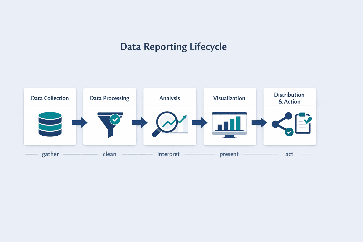
At its core, data reporting includes:
- Data collection — pulling information from databases, applications, or manual sources
- Data processing — cleaning, organizing, and validating that information for accuracy
- Analysis — identifying trends, patterns, and meaningful comparisons
- Visualization — presenting findings as charts, tables, or dashboards
- Distribution and action — sharing reports with stakeholders who use them to make decisions
Data reporting and data analysis are related but not identical. Analysis is the detective work—finding patterns, testing hypotheses, digging into “why.” Reporting packages those findings into structured, repeatable formats that people can scan quickly and act on.
Types of Data Reporting
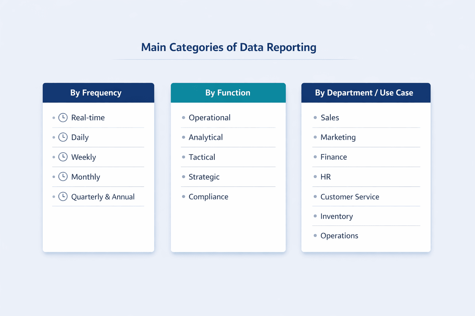
Data reporting varies by how often it’s generated, what function it serves, and who uses it. Here’s how the main categories break down.
By Frequency
- Real-time reporting — live dashboards that update continuously; used when immediate visibility matters (operations, web traffic, system monitoring)
- Daily reporting — automated summaries delivered each morning; common for sales pipelines, customer support queues, or inventory levels
- Weekly reporting — mid-cadence updates for team performance, campaign progress, or project status
- Monthly reporting — standard business rhythm for department KPIs, financial summaries, and marketing ROI
- Quarterly and annual reporting — strategic reviews and regulatory filings; focuses on big-picture trends and compliance requirements
By Function
- Operational reporting — tracks day-to-day efficiency metrics like cycle time, resource utilization, and incident response
- Analytical reporting — digs into trends, patterns, and “why” questions to support strategic planning
- Tactical reporting — mid-level summaries for managers to adjust short-term execution
- Strategic reporting — high-level views for executives making long-term decisions
- Compliance reporting — structured formats required by regulators or industry standards (SEC filings, HIPAA audits, tax reports)
By Department/Use Case
- Sales reporting — revenue, pipeline value, conversion rates, quota attainment
- Marketing reporting — campaign performance, lead generation, cost per acquisition, engagement metrics
- Financial reporting — profit and loss, cash flow, balance sheet, budget variance
- HR reporting — headcount, turnover, recruiting pipeline, performance reviews
- Customer service reporting — response times, resolution rates, satisfaction scores
- Inventory reporting — stock levels, turnover rates, supply chain bottlenecks
- Operational reporting — productivity, quality metrics, incident tracking
Data Reporting Examples
Here’s what data reporting looks like in practice across different business functions.
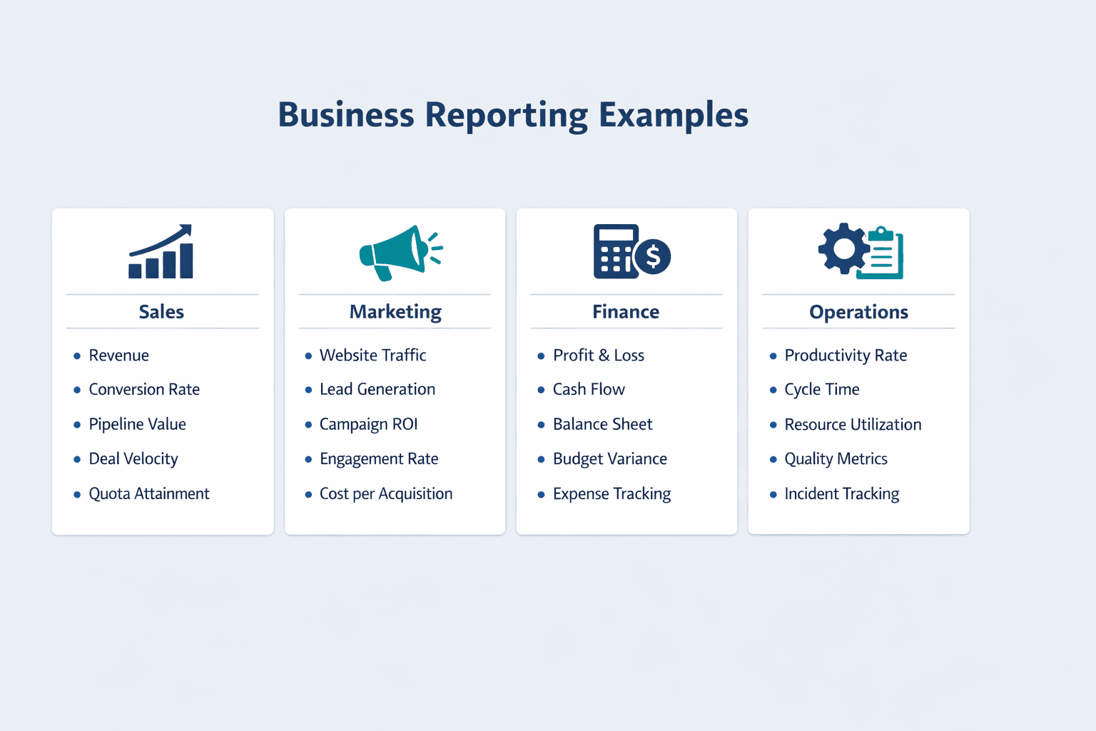
Sales Data Reporting Example
A typical sales report tracks team performance against targets—usually delivered weekly or monthly to sales leadership. The report might come from a CRM like Salesforce and show pipeline health, deal velocity, and individual rep performance.
Common metrics in sales reports include:
- Revenue — total bookings or closed-won value in the period
- Conversion rates — percentage of leads that turn into opportunities or deals
- Pipeline value — total dollar amount of deals in progress
- Deal velocity — average time from opportunity creation to close
- Quota attainment — percentage of sales targets each rep has hit
Marketing Data Reporting Example
Marketing reports track campaign performance across channels—paid ads, email, social, organic search. These are usually shared weekly or monthly with marketing leadership and often include attribution data showing which channels drive the most conversions.
Common metrics in marketing reports include:
- Website traffic — visits, unique visitors, and traffic sources
- Lead generation — form submissions, content downloads, demo requests
- Campaign ROI — revenue or conversions compared to ad spend
- Engagement rates — click-through rates, time on page, social interactions
- Cost per acquisition — total marketing spend divided by new customers acquired
Financial Data Reporting Example
Financial reports serve both internal management and external stakeholders—investors, auditors, regulators. They’re typically generated monthly (for internal review) and quarterly or annually (for external compliance). SEC 10-K filings are a real-world example of structured financial reporting.
Common elements in financial reports include:
- Profit and loss — revenue, expenses, and net income
- Cash flow — cash in, cash out, and ending balance
- Balance sheet metrics — assets, liabilities, and equity
- Budget variance — actual spending compared to plan
- Expense tracking — categorized spending by department or project
Operational Data Reporting Example
Operational reports focus on efficiency and process health—production output, system uptime, support ticket resolution. These are often daily or real-time dashboards used by operations managers and frontline teams.
Common operational metrics include:
- Productivity rates — units produced per hour, or tickets closed per day
- Cycle time — average time to complete a task or process
- Resource utilization — percentage of capacity being used (equipment, labor, server load)
- Quality metrics — defect rates, error rates, or customer satisfaction scores
- Incident tracking — MTTR and MTBF (mean time to repair/failure) for systems and processes
How Reporting Data Works
Data reporting follows a repeatable process from raw data to finished report. Here’s how it breaks down step by step.
Step 1 - Data Collection
Data is gathered from wherever it lives—databases, SaaS applications, spreadsheets, APIs, or manual entry. IBM describes this as the data integration stage, where information from multiple sources gets pulled into one place.
Common data sources include:
- CRM systems — Salesforce, HubSpot, Pipedrive
- Analytics platforms — Google Analytics, Adobe Analytics, Mixpanel
- ERP software — SAP, Oracle NetSuite, Microsoft Dynamics
- Databases — SQL servers, data warehouses, cloud storage
- Spreadsheets — CSV exports, Excel files, Google Sheets
Step 2 - Data Processing
Raw data is messy—duplicates, formatting inconsistencies, missing values. Processing cleans and prepares it for analysis. NIST’s data governance framework emphasizes that accuracy, timeliness, and consistency are critical at this stage.
Processing activities include:
- Data cleaning — removing duplicates, fixing errors, standardizing formats
- Validation — checking for completeness and accuracy
- Transformation — converting data into usable formats (currency conversion, date normalization)
- Aggregation — summing totals, calculating averages, grouping by category
Step 3 - Data Analysis
Processed data is analyzed to extract meaningful insights. This is where you look for trends, compare performance against benchmarks, and identify patterns worth reporting.
Analysis techniques include:
- Trend analysis — tracking changes over time (month-over-month growth, seasonal patterns)
- Comparison — benchmarking against targets, competitors, or historical performance
- Benchmarking — measuring against industry standards or internal baselines
- Pattern identification — spotting correlations, anomalies, or recurring issues
Step 4 - Data Visualization
Data is presented visually so people can understand it quickly. Microsoft notes that modern reports often include interactive features—drill-throughs, filters, and cross-filtering—not just static charts.
Common visualization types include:
- Charts — bar charts, line graphs, pie charts
- Graphs — scatter plots, area charts, combo charts
- Dashboards — multi-chart views that update in real time
- Tables — structured data grids with sorting and filtering
- Heat maps — color-coded grids showing intensity or performance
- Scorecards — KPI summaries with status indicators (green/yellow/red)
Step 5 - Distribution and Action
Reports are shared with the people who need them—via email, shared dashboards, scheduled meetings, or on-demand access. The goal is to enable decisions, not just inform.
Distribution methods include:
- Automated emails — scheduled reports delivered to inboxes
- Shared dashboards — live links or embedded views in collaboration tools
- Scheduled meetings — weekly reviews or monthly business reviews
- On-demand access — self-service portals where users pull reports as needed
Data Reporting Services
Data reporting services are software platforms that automate the collection, processing, visualization, and distribution of business data. Organizations use them when manual reporting becomes too slow, too error-prone, or too difficult to scale across multiple teams and data sources.
Types of Data Reporting Services
- Business intelligence platforms — comprehensive tools like Power BI, Tableau, or Qlik that connect to multiple data sources and offer advanced analytics
- Reporting software — focused tools that generate scheduled reports and dashboards (Google Data Studio, Looker)
- Custom reporting solutions — internal tools built by data teams for specific business needs
- Managed reporting services — outsourced analytics where a vendor handles data setup, reporting, and insights
- Embedded analytics tools — reporting features built into other software (CRM dashboards, ERP reporting modules)
What Data Reporting Services Provide
These services reduce manual work and make reporting scalable:
- Automated data collection — scheduled pulls from databases, APIs, and SaaS tools
- Real-time dashboards — live views that update as data changes
- Custom report building — drag-and-drop interfaces or SQL-based report creators
- Data integration — connectors to common platforms (Salesforce, Google Analytics, Shopify)
- Scheduled reporting — automatic email delivery or dashboard refreshes
- Multi-user access — role-based permissions and shared workspaces
- Export capabilities — download reports as PDF, Excel, or CSV
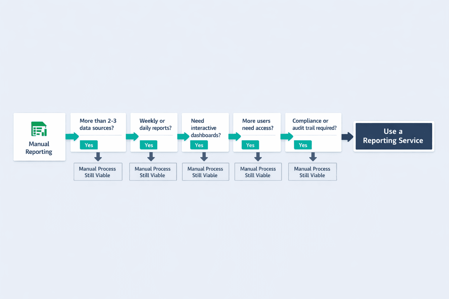
When to Use Data Reporting Services
Dedicated reporting services make sense when spreadsheets and manual work start breaking down. Consider a service when:
- Multiple data sources — you’re pulling from more than 2-3 platforms and manual merging is slow
- Frequent reporting needs — you’re generating the same reports weekly or daily
- Complex visualizations required — stakeholders need interactive dashboards, not static PDFs
- Growing team — more people need access to data, and emailing spreadsheets doesn’t scale
- Compliance requirements — you need audit trails, version control, or automated retention policies
Popular Data Reporting Tools
| Tool | Best For | Key Features | Pricing Range |
|---|---|---|---|
| Power BI | Microsoft ecosystem users | Real-time dashboards, AI insights, cloud/desktop versions | Free–$24/user/month |
| Qlik | Enterprise analytics | Associative data model, advanced visualizations, embedded analytics | $300–$2,750/month |
| Sisense | Embedded analytics | White-label dashboards, developer-friendly, scheduled reports | $399–custom |
| Domo | Fast growing teams | Consumption-based pricing, app marketplace, mobile-first design | Custom (30-day trial) |
| Tableau | Data storytelling | Drag-and-drop interface, strong visualization library, Salesforce integration | Viewer/Explorer/Creator tiers |
Best Practices for Effective Data Reporting
Good reporting isn’t about cramming every metric into a dashboard—it’s about making data useful. Here’s what works:
- Define clear objectives — Know what decisions the report needs to support before you start building it
- Know your audience — Executives want summaries; analysts want drill-downs; different reports for different roles
- Choose relevant metrics — Track what matters, not everything you can track
- Maintain data accuracy — 59% of organizations don’t measure data quality, which means most reports sit on shaky foundations
- Use appropriate visualizations — Bar charts for comparisons, line graphs for trends, heat maps for intersections
- Keep reports simple — Tableau warns against cramming dashboards with every relevant view—focus beats clutter
- Provide context — A number without a benchmark, target, or trend is just trivia
- Enable action — Every report should make the next step obvious
Common Data Reporting Challenges
Even with good tools, reporting runs into predictable obstacles:
- Data silos — information stuck in separate systems that don’t talk to each other; Gartner identifies inconsistency across siloed sources as the hardest quality problem to fix
- Poor data quality — incomplete records, outdated information, duplicate entries; in a 2024 Gartner survey, 44% of sales leaders cited poor data quality as a barrier to analytics effectiveness
- Information overload — too many metrics, too many reports, not enough signal
- Lack of context — dashboards that show numbers without explaining whether they’re good, bad, or expected
- Outdated reports — stale data that doesn’t reflect current reality
- Technical complexity — tools that require SQL skills or IT support to generate a simple report
The right tools and processes address most of these. IBM notes that centralized platforms reduce bottlenecks and eliminate manual entry—making reporting faster, cleaner, and more reliable.