Best Data Reporting Tools in 2025
We compared Power BI, Tableau, Looker Studio Pro, Databox, and Looker across pricing, integrations, and use cases. Power BI starts at $14/user, Tableau at $42/user, and Databox offers unlimited users at $159/month.
Quick Verdict
The best data reporting tools in 2025 are Power BI for Microsoft-centric teams ($14/user/month), Tableau for advanced visualization ($42-75/user/month), Looker Studio Pro for Google ecosystems (monthly per-user billing), Databox for marketing teams ($159/month annually), and Looker for governed enterprise BI (custom quote). Each excels in different scenarios—Power BI wins on cost and Microsoft integration, Tableau leads in visual analytics, Looker Studio Pro fits Google Workspace shops, Databox accelerates marketing reporting, and Looker handles semantic modeling at scale.
What makes a tool “best” comes down to your specific context. The right platform depends on your team size, existing tech stack, governance requirements, visualization needs, and whether you’re reporting for marketing, finance, or operations. Most tools offer similar baseline capabilities—chart building, data connections, scheduled reports—but differ sharply in pricing models, learning curves, integration breadth, and how they handle collaboration at scale.
This comparison covers the leading platforms based on Gartner’s June 2025 Magic Quadrant and real-world pricing as of May 2026. You’ll see how each tool is priced, what it does best, and which use cases it actually fits—no fluff.
What Are Data Reporting Tools?
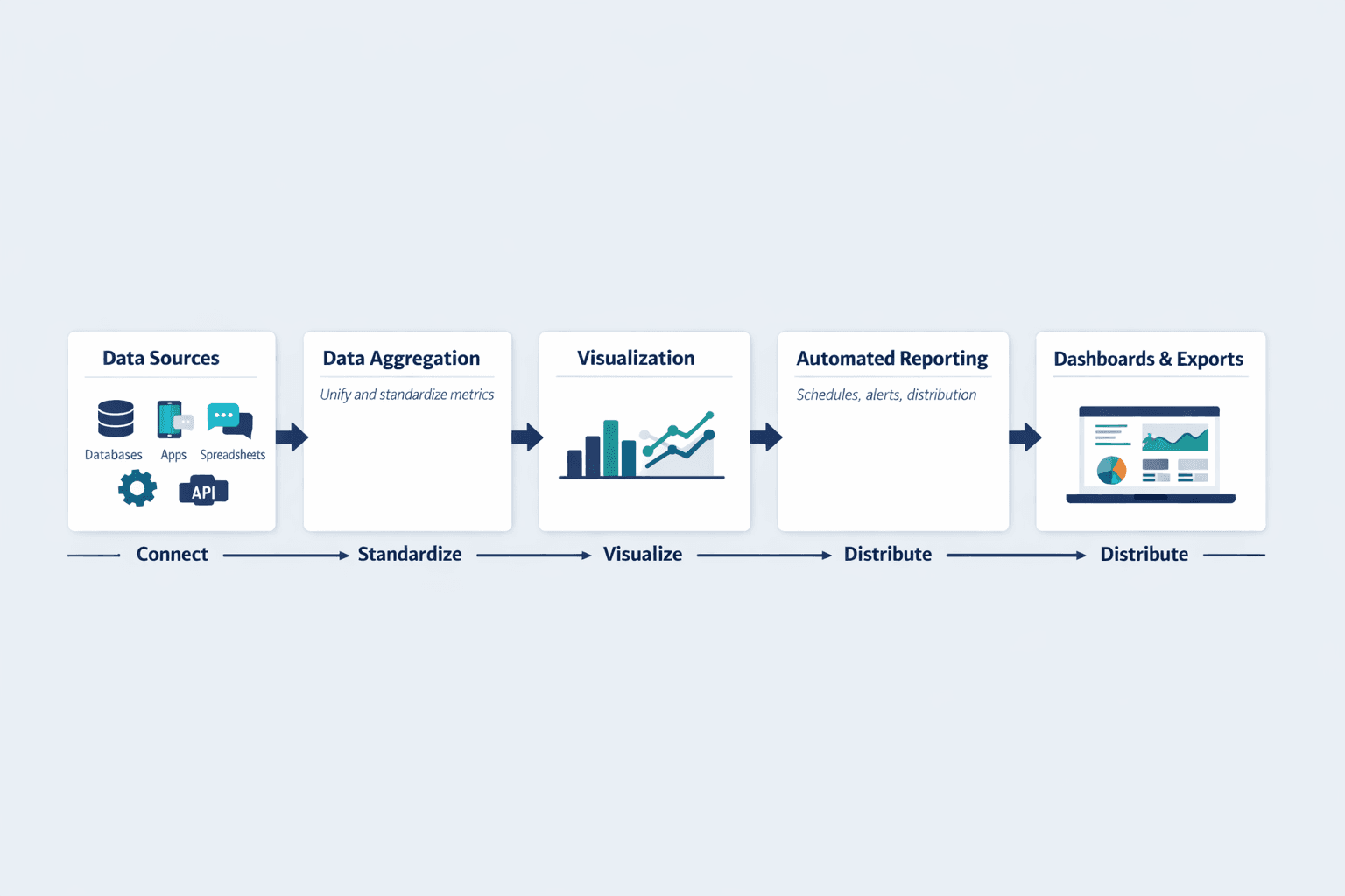
Data reporting tools turn raw data into visual reports and dashboards that help teams make informed decisions. They pull data from multiple sources, standardize metrics, and present information in charts, tables, and automated reports.
Core capabilities that define reporting tools:
- Data aggregation — Connect databases, apps, spreadsheets, and APIs into a unified view
- Visualization — Build charts, graphs, maps, and interactive dashboards
- Automated reporting — Schedule reports, set up alerts, and distribute insights on autopilot
- Dashboard creation — Design shareable views tailored to specific teams or roles
- Export and sharing — Publish reports as PDFs, embed dashboards, or share live links
Reporting tools differ from pure analytics platforms (which focus on statistical modeling and prediction) and full business intelligence suites (which add data warehousing, ETL, and semantic layers). Reporting tools prioritize communication of insights over discovery of insights—though most modern platforms blur these lines.
Best Data Reporting Tools 2026
The tools below were evaluated on pricing transparency, feature depth, integration breadth, collaboration support, and positioning in Gartner’s 2025 Magic Quadrant. Each section includes official pricing verified as of May 31, 2026.
Power BI - Best for Microsoft-Centric Teams
Power BI is Microsoft’s business intelligence platform built for teams already using Office 365, Azure, or Dynamics. It’s the strongest all-around choice for organizations standardized on Microsoft—Pro licenses are often bundled with Microsoft 365 E5, and the free tier lets you build reports without paying anything.
Microsoft was positioned highest for Ability to Execute and furthest for Completeness of Vision in Gartner’s June 2025 Magic Quadrant.
Key features:
- Native connectors for Azure, SQL Server, Excel, SharePoint, Teams, and 100+ other sources
- AI-powered insights and natural language queries (“Show revenue by region”)
- Paginated reports for pixel-perfect financial statements and invoices
- Desktop app for advanced modeling plus web and mobile for viewing and editing
- Up to 48 dataset refreshes per day on Premium Per User (8/day on Pro)
- Row-level security and data encryption for enterprise governance
| Plan | Price | Features |
|---|---|---|
| Free | $0 | Create reports, limited sharing |
| Pro | $14/user/month (annual) | Report sharing, 8 refreshes/day, 10GB storage |
| Premium Per User | $24/user/month (annual) | Advanced AI, 48 refreshes/day, larger models, XMLA read/write |
Best For: Organizations already using Microsoft 365 or Azure; teams that want low per-seat costs and don’t need bleeding-edge visualization customization.
Tableau - Best for Advanced Visualization
Tableau is the gold standard for interactive data exploration and visual storytelling. If you need custom visualizations, advanced analytics, or pixel-perfect dashboards for executives, Tableau is the strongest choice—but you’ll pay for it.
Tableau offers the deepest visualization library and most flexible chart customization of any reporting tool. It also supports extensions in R, Python, and MATLAB for teams doing statistical modeling alongside reporting.
Key features:
- Hundreds of native data connectors—spreadsheets, PDFs, big data, cloud databases, on-prem sources
- Drag-and-drop interface with no-code chart building and interactive filtering
- Extensibility via R, Python, MATLAB, dashboard extensions, and embedded analytics
- Creator licenses for building workbooks; Explorer for editing; Viewer for consuming
- Slack integration for snapshots, alerts, and comment notifications
- Advanced Management and Data Management add-ons on Enterprise
| Plan | Price | Features |
|---|---|---|
| Viewer (Standard) | $15/user/month (annual) | View and interact with dashboards |
| Explorer (Standard) | $42/user/month (annual) | Edit workbooks, explore data |
| Creator (Standard) | $75/user/month (annual) | Build new workbooks and data flows |
| Enterprise | Viewer $35, Explorer $70, Creator $115 (annual) | Advanced governance, platform management |
Best For: Data analysts and BI teams that need deep visual customization; enterprises with complex governance and high-value dashboard projects.
Looker Studio Pro - Best for Google Ecosystems and Collaborative Reporting
Looker Studio Pro is Google’s reporting platform designed for teams already using Google Workspace or Google Cloud. The base product is free and browser-based; Pro adds team workspaces, organizational content ownership, and technical support.
Looker Studio Pro is strongest for marketing teams reporting on Google Analytics, Ads, and BigQuery. Unlike other tools, content belongs to the organization rather than individual creators—critical for growing teams.
Key features:
- Native integrations with Google Analytics, Ads, BigQuery, Sheets, and 800+ partner connectors
- Fully browser-based—no desktop app required
- Team workspaces for collaborative report building
- Organizational ownership of dashboards and reports (not tied to individual accounts)
- Technical support via Google Cloud (not available on free tier)
- Customizable charts, calculated fields, and blended data sources
| Plan | Price | Features |
|---|---|---|
| Looker Studio (Free) | $0 | Unlimited reports, basic sharing |
| Looker Studio Pro | Monthly per user | Team workspaces, org ownership, technical support |
Requirements: Google Workspace or Cloud Identity plus a Google Cloud project linked to billing.
Best For: Marketing teams and agencies reporting on Google ecosystem data; organizations that want browser-only reporting without desktop software.
Databox - Best for Marketing and SMB Reporting
Databox is built for marketers, agencies, and small businesses that need fast dashboard deployment without heavy BI infrastructure. It emphasizes speed—20,000+ scaling businesses use it for same-day reporting setup.
Databox is the simplest tool on this list for connecting ad platforms, CRMs, and web analytics. Unlike enterprise BI tools that require data modeling, Databox comes with prebuilt dashboards and automated weekly reports out of the box.
Key features:
- 130+ integrations including Google Analytics, Facebook Ads, HubSpot, Salesforce, Stripe, Shopify
- Unlimited users on all plans—no per-seat licensing
- Pre-built templates for marketing, sales, finance, and support reporting
- Automated weekly reports and AI-generated performance summaries
- Goals, forecasts, and KPI tracking with mobile app alerts
- Direct SQL database connectors and custom integrations on higher tiers
| Plan | Price | Features |
|---|---|---|
| Professional | $159/month (annual) | Unlimited users, unlimited dashboards, automated reports |
| Growth | Custom | Data prep, SQL connectors, AI summaries |
| Premium | $799/month (annual) | 100 data sources, 15-minute syncs for 5 sources |
Every plan starts with a 14-day full-feature trial.
Best For: Marketing teams and agencies needing fast setup; SMBs that want unlimited users without per-seat costs.
Looker - Best for Governed Enterprise BI and Embedded Analytics
Looker is Google’s enterprise BI platform designed for organizations that need semantic modeling, governed metrics, and scalable data definitions. Unlike dashboard-first tools, Looker emphasizes reusable data logic and platform-level governance.
Looker is strongest for companies embedding analytics into products, managing complex multi-tenant reporting, or enforcing strict data definitions across hundreds of users.
Key features:
- Semantic modeling layer (LookML) for reusable metric definitions
- Platform administration with role-based access and API quotas
- Embed edition for white-labeled analytics in SaaS products
- Conversational analytics powered by Gemini (unlimited through September 2026)
- Advanced security, SSO, and audit logging
- Developer and Standard user licenses with different capabilities
| Plan | Price | Features |
|---|---|---|
| Standard | Custom quote | Up to 50 users, 10 Standard + 2 Developer licenses |
| Enterprise | Custom quote | Enhanced security, higher API quotas, semantic modeling |
| Embed | Custom quote | White-labeled analytics for products |
Pricing combines platform cost plus user licenses—contact Google Cloud sales for quotes.
Best For: Large enterprises needing governed metrics and reusable data definitions; SaaS companies embedding analytics in products.
Data Reporting Software: Key Features to Compare
When evaluating tools, focus on capabilities that match your team’s workflow—not just the longest feature list. Gartner defines strong platforms by visualization, collaboration, and data preparation capabilities.
Visualization Capabilities
Good visualizations communicate insights faster than tables of numbers. The right chart type makes patterns obvious; the wrong one hides them.
What to evaluate:
- Chart variety — Does the tool support the specific visualizations you need? (bar, line, scatter, heatmap, geographic, funnel, Sankey)
- Customization depth — Can you adjust colors, labels, axes, tooltips, and formatting to match your brand?
- Interactive elements — Filters, drill-downs, hover details, linked charts that respond to user clicks
- White-labeling — Remove vendor branding for client-facing reports or embedded dashboards
- AI-suggested charts — Tools like Power BI and Tableau recommend the best chart type based on your data
Tableau leads here with the deepest customization. Power BI offers strong AI-powered chart recommendations. Databox trades customization for speed with pre-built templates.
Integration and Data Sources
Reporting tools are only as useful as the data they can reach. Every platform claims “hundreds of integrations,” but the details matter.
What to evaluate:
- Native connectors — Pre-built integrations that don’t require code (Google Analytics, Salesforce, Stripe, databases)
- API access — Can you build custom connectors for internal tools or niche platforms?
- Database support — Direct connections to MySQL, PostgreSQL, SQL Server, Oracle, BigQuery, Snowflake
- Sync frequency — How often does data refresh? (real-time, every 15 minutes, hourly, daily)
- Connector reliability — Do integrations break frequently? Check user reviews.
Databox offers 130+ integrations with a focus on marketing and sales tools. Tableau supports native connectors for spreadsheets, big data, cloud and on-prem databases, and application data. Looker emphasizes governed connections via semantic modeling.
Automation and Scheduling
Manual reporting doesn’t scale. Automation turns reporting from a weekly chore into a background process.
What to evaluate:
- Scheduled reports — Email PDFs or links on a recurring schedule (daily, weekly, monthly)
- Automated alerts — Notifications when metrics cross thresholds or show anomalies
- Distribution lists — Send different reports to different stakeholders automatically
- Refresh frequency — How often can datasets update? Power BI Pro supports 8 refreshes/day; Premium Per User supports 48/day
- Conditional logic — Trigger reports only when specific conditions are met
Databox Premium supports 15-minute syncs for up to five data sources—useful for real-time marketing dashboards.
Collaboration Features
Data reporting is a team sport. The best tools make it easy to share insights, leave comments, and control access.
What to evaluate:
- Sharing permissions — Granular control over who can view, edit, or share reports
- Commenting and annotations — In-line discussions on specific charts or data points
- Version control — Track changes and revert to previous report versions
- Team workspaces — Organize dashboards by department, project, or client
- Organizational ownership — Looker Studio Pro keeps content owned by the organization, not individuals
Databox offers unlimited users on all plans—no per-seat fees. Tableau integrates with Slack for notifications and collaboration. Power BI ties into Microsoft Teams for embedded dashboards.
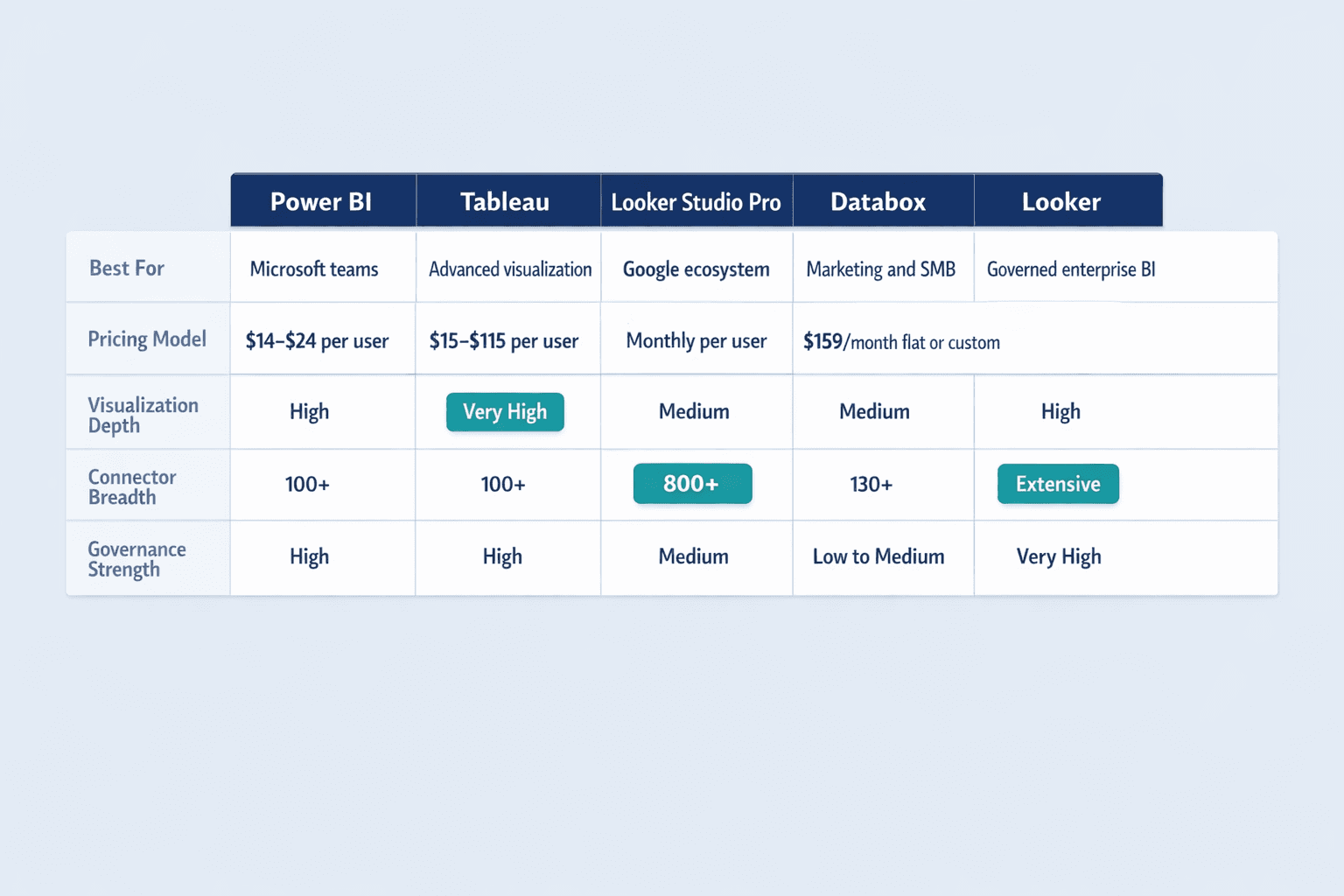
Data Reporting Solutions: Comparison Table
| Tool | Starting Price | Best For | Key Strength | Integrations | Learning Curve | Free Trial |
|---|---|---|---|---|---|---|
| Power BI | $14/user/month | Microsoft-centric teams | Low cost, deep MS integration | 100+ | Medium | Free account available |
| Tableau | $42/user/month | Advanced visualization | Best-in-class charts | 100+ | Steep | 14 days |
| Looker Studio Pro | Monthly per user | Google ecosystem | Browser-only, org ownership | 800+ | Low | Free tier available |
| Databox | $159/month | Marketing/SMB | Unlimited users, fast setup | 130+ | Low | 14 days |
| Looker | Custom quote | Governed enterprise BI | Semantic modeling | Extensive | Steep | Contact sales |
Reporting Tools for Data Analysis: Use Case Scenarios
Different tools excel in different contexts. Here’s how to match platforms to real-world scenarios.
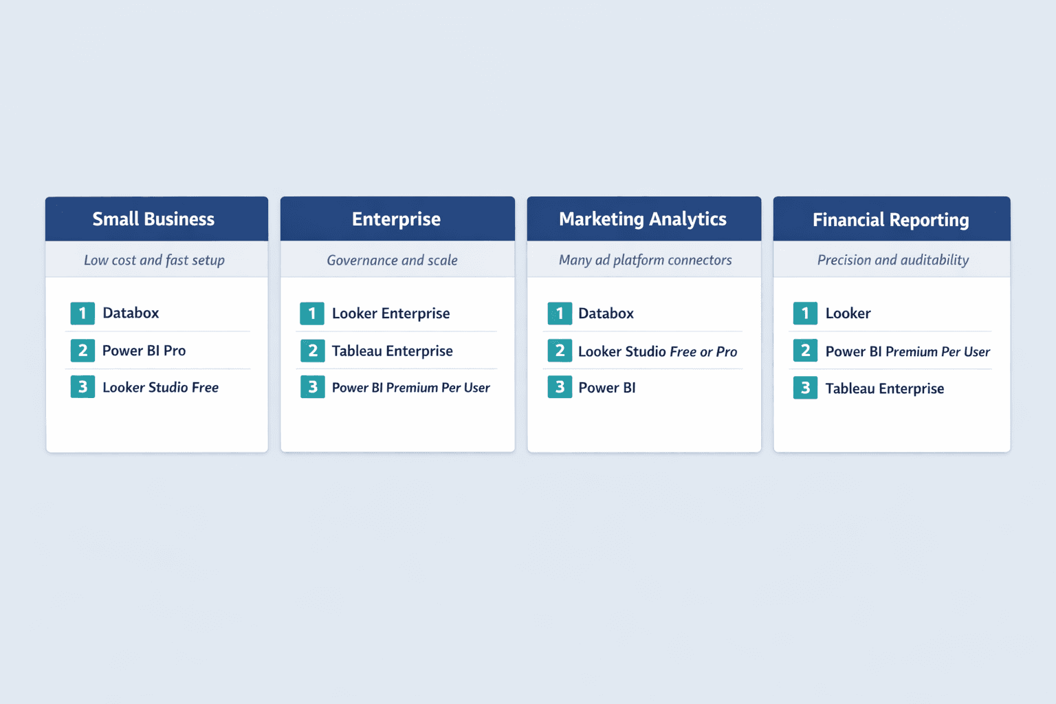
Small Business Reporting
Small businesses need affordable pricing, fast setup, and minimal training time. Per-seat costs add up quickly, so unlimited-user pricing or low per-seat rates matter.
Best tools for SMBs:
- Databox — Unlimited users on Professional, 14-day trial, same-day dashboard deployment. Best for marketing-heavy SMBs.
- Power BI Pro — $14/user/month with a free account for report creation. Best for SMBs already using Microsoft 365.
- Looker Studio (Free) — No cost for unlimited reports. Best for SMBs in the Google ecosystem with basic reporting needs.
Avoid enterprise platforms like Looker or Tableau Enterprise—setup complexity and custom pricing don’t fit SMB budgets or timelines.
Enterprise-Level Reporting
Enterprises need governance, scalability, and security controls. The cheapest tool is rarely the right tool at this scale—focus on platform administration, role-based access, and semantic modeling.
Best tools for enterprises:
- Looker Enterprise — Semantic modeling and governed metrics for organizations with strict data definitions and hundreds of users.
- Tableau Enterprise — Advanced Management and Data Management for visual analytics at scale. Starts at $35-115/user/month.
- Power BI Premium Per User — Larger models, advanced AI, 48 refreshes/day at $24/user/month. Best for Microsoft-centric enterprises.
Marketing Analytics Reporting
Marketing teams report on dozens of platforms—Google Ads, Facebook Ads, LinkedIn Ads, Google Analytics, HubSpot, Mailchimp, Stripe. Speed of integration matters more than deep customization.
Best tools for marketing:
- Databox — 75+ one-click integrations loaded with thousands of metrics. Automated weekly reports and AI summaries built in.
- Looker Studio (Free or Pro) — Native Google Analytics, Ads, and BigQuery connections. Best for teams already reporting on Google ecosystem data.
- Power BI — Strong if marketing data lives in Microsoft tools (Dynamics, Azure). Weaker on direct ad platform connections compared to Databox.
Financial Reporting
Finance teams need precision, governance, and audit trails. Charts matter less than accurate numbers, version control, and compliance-ready access logs.
Best tools for financial reporting:
- Looker — Semantic modeling ensures consistent metric definitions across all reports. Strong for regulated industries.
- Power BI Premium Per User — XMLA endpoint access and advanced security for large financial models. Best for Microsoft-centric finance teams.
- Tableau Enterprise — Data Management and Advanced Management support governance-heavy use cases like executive financial reporting.
Avoid marketing-first tools like Databox—they’re built for speed, not governance.
How to Choose the Right Data Reporting Tool
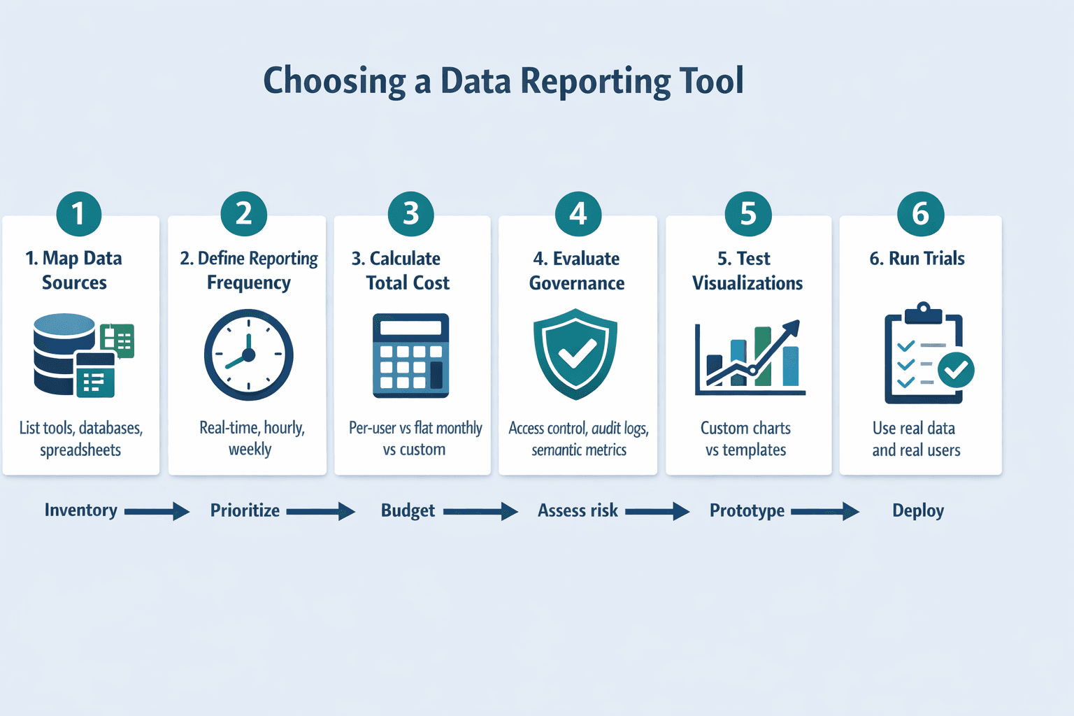
Choosing between these platforms comes down to your specific context. Follow this framework:
- Map your data sources (15 minutes): List every tool, database, and spreadsheet you need to report on. Check which platforms offer native connectors for your stack—custom integrations add weeks to deployment.
- Define reporting frequency (10 minutes): Do you need real-time dashboards, hourly updates, or weekly reports? Power BI Pro supports 8 refreshes/day; Premium Per User supports 48/day. Databox Premium offers 15-minute syncs for five sources.
- Calculate total cost (20 minutes): Don’t compare advertised starting prices—calculate your actual cost based on team size and usage. Power BI and Tableau charge per user. Databox charges flat monthly fees with unlimited users. Looker uses custom platform-plus-user pricing.
- Evaluate governance needs (10 minutes): Do you need role-based access, audit logs, and centralized metric definitions? If yes, prioritize Looker or enterprise editions of Tableau and Power BI. If no, lighter tools like Databox or Looker Studio work fine.
- Test visualization requirements (30 minutes): Build a sample dashboard in trial accounts. If your team needs highly customized charts, Tableau wins. If pre-built templates work, Databox is faster. If you need basic charts with strong collaboration, Looker Studio Pro fits.
- Run trials before committing (1-2 weeks): Databox offers 14 days, Tableau offers 14 days, and Power BI has a free account. Test with real data and real users—don’t rely on vendor demos.
Conclusion: Best Data Reporting Tool for Your Needs
If you’re already on Microsoft 365, start with Power BI—it’s the most cost-effective option with strong baseline capabilities. If you need the best visualizations and have budget to spare, choose Tableau. If you’re in the Google ecosystem and want browser-only reporting, go with Looker Studio Pro. If you’re a marketing team or SMB that wants unlimited users and fast setup, pick Databox. If you need governed metrics and semantic modeling at enterprise scale, choose Looker.
The “best” tool changes based on your team size, existing tech stack, governance requirements, and whether you’re reporting for marketing, finance, or operations. Don’t chase the longest feature list—choose the platform that fits your workflow and budget, then test it with real data before signing a contract.
Start by signing up for free trials: Databox offers 14 days, Power BI has a free account, and Looker Studio’s base product is free with optional Pro upgrade. Build one dashboard with your actual data sources—you’ll know within a week which tool fits your team.