Data Analytics and Reporting: Key Differences
Data reporting shows what happened through dashboards and KPIs. Data analytics explains why it happened and predicts what's next using statistics and modeling.
Quick Verdict
Data reporting presents collected information in structured formats like dashboards and tables, while data analytics examines that information to discover patterns and predict future outcomes. Reporting answers “what happened,” analytics explains “why it happened” and “what might happen next.”
Understanding this distinction matters because choosing the wrong approach wastes resources—over-analyzing simple tracking needs or under-analyzing strategic decisions. According to Forrester’s 2024 survey, nearly one-third of organizations that rarely use data for decisions say their leaders prefer gut feel over data. The right mix of reporting and analytics changes that.
This guide covers the core differences between analytics and reporting, when to use each approach, how they work together, and how to choose the right method for different business needs.
What Is Data Analytics and Reporting?
Data analytics and reporting are complementary processes in data management. IBM defines reporting as collecting and presenting business data in structured formats, while analytics uses that data to uncover patterns, test hypotheses, and support decision-making. Reporting tells you sales dropped 15% last quarter; analytics tells you why and what to do about it.
Here’s how they relate:
- Data flows from reporting to analytics — Reports surface metrics that prompt analytical investigation
- Purpose differs fundamentally — Reporting monitors known metrics, analytics discovers unknown insights
- Outputs serve different needs — Reporting produces standardized dashboards, analytics generates strategic recommendations
- Users vary by role — Reporting serves stakeholders who need visibility, analytics serves decision-makers who need answers
- Time commitment differs — Reporting automates recurring updates, analytics requires exploratory investigation
Understanding Data Reporting
Data reporting organizes and presents collected data in structured formats like dashboards, tables, and scheduled email summaries. It’s the foundation for visibility—tracking what’s happening across your business without deep interpretation.
Key features of data reporting:
- Standardized metrics — Same KPIs measured the same way every time
- Regular cadence — Power BI supports scheduled reports delivered automatically on predefined frequencies
- Historical accuracy — Reports show what actually happened, preserved for comparison over time
- Visual clarity — Charts, tables, and dashboards make trends immediately visible
- Broad accessibility — Reports distribute insights to stakeholders who don’t work directly with raw data
- Operational focus — Designed for monitoring performance, not investigating causes
Understanding Data Analytics
Data analytics examines data to discover patterns, test hypotheses, and generate actionable insights that weren’t visible in standard reports. SAS defines analytics as using applied mathematics, statistics, predictive modeling, and machine learning to answer business questions and forecast trends.
Key features of data analytics:
- Exploratory investigation — Analysts dig into data without predetermined answers
- Statistical methods — Techniques like regression, clustering, and hypothesis testing reveal hidden relationships
- Predictive capabilities — IBM notes that predictive analytics uses historical data with modeling to forecast future outcomes
- Hypothesis testing — Analytics validates or disproves assumptions about why metrics changed
- Strategic value — Insights drive decisions about what to change, not just what to monitor
- Ad-hoc timing — Analysis happens when questions arise, not on fixed schedules
Data Analysis and Reporting: How They Differ
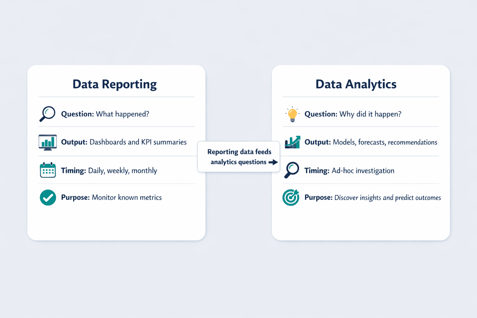
While these terms are often used interchangeably, they represent distinct stages in the data lifecycle with different purposes and outputs. Here’s how they compare:
| Dimension | Data Reporting | Data Analytics |
|---|---|---|
| Primary Purpose | Monitor known metrics and track performance | Discover insights and predict future outcomes |
| Key Questions Answered | What happened? When did it happen? | Why did it happen? What will happen next? |
| Output Types | Dashboards, scheduled reports, KPI summaries | Statistical models, forecasts, recommendations |
| Timing/Frequency | Recurring (daily, weekly, monthly) | Ad-hoc when questions arise |
| Skills Required | Data visualization, SQL, dashboard tools | Statistics, programming (Python/R), modeling |
| Tools Used | Power BI, Tableau, Looker, Google Data Studio | R, Python, SAS, SPSS, statistical packages |
| Audience | Executives, managers, operational teams | Decision-makers, strategy teams, analysts |
Purpose and Objectives
Reporting focuses on tracking known metrics—the KPIs you’ve already decided matter. Analytics focuses on discovering unknown insights—the patterns you didn’t know to look for. Forrester’s 2024 Marketing Survey found that nearly two-thirds of marketing leaders reported low trust in their measurement, suggesting that reporting alone doesn’t create confidence without analytical interpretation.
Real business scenarios show the difference:
- Reporting objective: Track monthly revenue by product line to confirm targets are met
- Analytics objective: Investigate why Product A revenue dropped 20% while Product B grew 15% in the same timeframe
- Reporting objective: Monitor daily website traffic and conversion rates on a dashboard
- Analytics objective: Test whether changing the checkout flow increased conversion rates or if seasonal factors caused the change
- Reporting objective: Display customer churn rate in weekly executive summaries
- Analytics objective: Build a model predicting which customers will churn next quarter and why
Methods and Techniques
Reporting uses data aggregation and visualization to present metrics clearly. Analytics uses statistical methods and modeling to uncover relationships and predict outcomes. Power BI documentation shows common reporting interactions: filtering, sorting, drilling down, and exporting charts.
Techniques differ significantly:
Reporting techniques:
- Dashboard creation with key metrics
- SQL queries to aggregate historical data
- Scheduled data refreshes
- Visual charts (bar, line, pie)
- Pivot tables and cross-tabs
Analytics techniques:
- Regression analysis to identify drivers
- Clustering to segment customers or products
- Predictive modeling using machine learning
- Anomaly detection to surface outliers
- Forecasting future trends
- Hypothesis testing to validate assumptions
- Decision trees to map outcomes
Outputs and Deliverables
Reporting produces standardized, recurring outputs designed for broad distribution. Analytics produces exploratory, one-time insights tailored to specific business questions.
Typical reporting deliverables:
- Weekly sales dashboard emailed to executives
- Monthly KPI summary with year-over-year comparisons
- Scheduled Power BI report sent automatically every Monday
- Real-time operational dashboard tracking production metrics
- PDF report exports for stakeholder meetings
Typical analytical deliverables:
- Customer churn prediction model with risk scores
- Root cause analysis of revenue decline
- Forecasting model for next quarter’s demand
- A/B test results showing which strategy performed better
- Synthetic data quality report evaluating utility and privacy metrics
Time and Resource Requirements
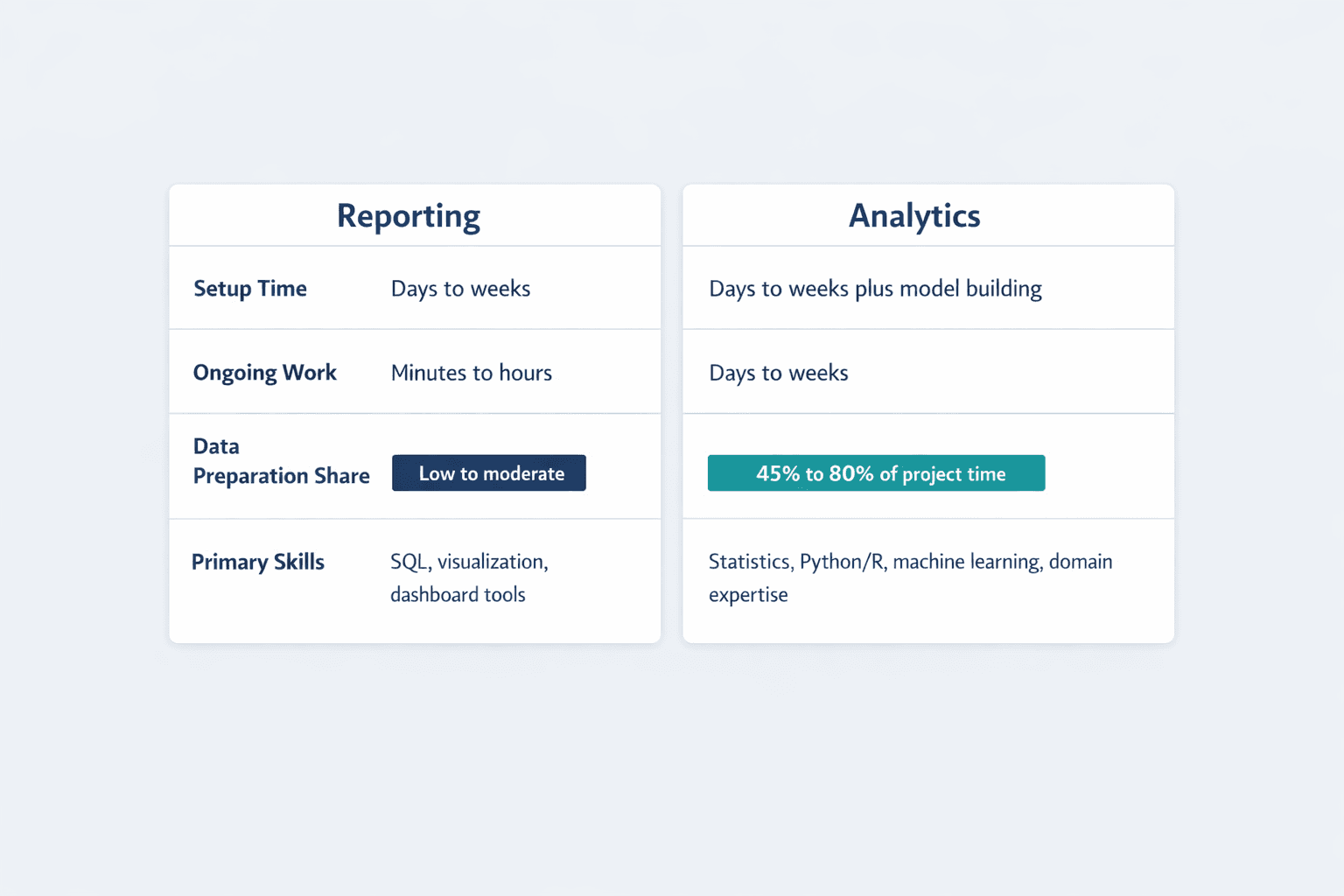
Reporting is typically faster and more automated once infrastructure is set up. Analytics requires more time for exploration and interpretation. IBM estimates that data preparation alone consumes 50% to 70% of a data mining project’s time and effort.
Reporting time investment:
- Initial setup: Days to weeks (connecting data sources, designing dashboards)
- Ongoing maintenance: Minutes to hours (monitoring refresh schedules, updating filters)
- Output generation: Automated (reports distribute on schedule)
Analytics time investment:
- Data preparation: 45% to 80% of project time spent cleaning and transforming data
- Analysis work: Days to weeks (exploring patterns, building models, testing hypotheses)
- Interpretation: Hours to days (translating findings into business recommendations)
Skill level required:
- Reporting: SQL, data visualization, dashboard tools
- Analytics: Statistics, programming, machine learning, domain expertise
Tool complexity:
- Reporting: User-friendly interfaces like Power BI with point-and-click configuration
- Analytics: Statistical software and programming environments requiring technical training
Data Analytics Reporting: Combining Both Approaches
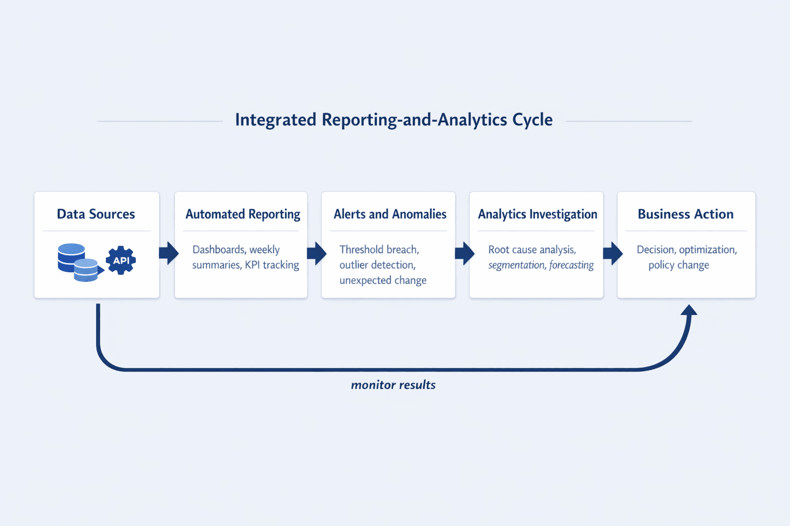
Data analytics reporting is an integrated approach that combines automated reporting infrastructure with analytical capabilities. Modern platforms like Power BI embed analytics features—automatic insights, anomaly detection, pattern recognition—directly into reporting dashboards.
Organizations benefit from combining analytics and reporting in these ways:
- Enhanced decision-making — Reports surface metrics, embedded analytics explain what changed and why
- Trend identification — Dashboards monitor performance, analytics highlight meaningful patterns vs. noise
- Anomaly detection — Amazon QuickSight continuously analyzes millions of metrics to discover outliers automatically
- Predictive insights in standard reports — Monthly dashboards include forecasts alongside historical performance
- Threshold-based investigation — Power BI alerts trigger when metrics cross thresholds, prompting deeper analysis
- Shared data foundation — IBM explains that data intelligence helps both BI users and data scientists find curated, high-quality datasets from the same source
When to Use Integrated Approaches
Combining analytics and reporting delivers the most value when you need continuous monitoring with the ability to investigate when something changes. Amazon QuickSight distinguishes between anomaly detection (finding unexpected patterns) and forecasting (predicting future trends)—both complement standard reporting.
Specific use cases for integrated approaches:
- Performance monitoring with predictive alerts — Track sales KPIs on a dashboard, receive alerts when metrics deviate from forecasted ranges, then investigate why
- Customer behavior tracking with segmentation analysis — Monitor overall customer metrics weekly, run clustering analysis quarterly to identify new customer segments
- Financial reporting with trend forecasting — Distribute standard P&L reports monthly, include 90-day revenue forecasts with scenario modeling
- Operational dashboards with root cause analysis — Power BI automatic page refresh monitors production metrics in real-time, triggers investigation when machine malfunction risk increases
- Government surveillance reporting with preparedness modeling — APHIS uses dashboard data to strengthen disease detection and outbreak preparedness
Automated Data Reporting: Streamlining the Process
Automated data reporting uses tools and workflows to generate and distribute reports without manual intervention. Once configured, reports refresh on schedule, deliver to stakeholders automatically, and free analysts to focus on interpretation rather than data collection.
Key benefits of automated reporting:
- Time savings — Power BI subscribers receive scheduled reports automatically instead of manually generating and sending each one
- Consistency — Same metrics calculated the same way every time, eliminating human error in formulas or data selection
- Accuracy — Automated pipelines reduce copy-paste mistakes and version control issues
- Real-time updates — Power BI automatic page refresh queries for new data at predefined intervals for near-real-time dashboards
- Scalability — One report can distribute to dozens or hundreds of stakeholders with no additional manual work
- Reduced human error — Automation eliminates manual data entry, formula mistakes, and missed deadlines
- Alert capabilities — Power BI data alerts notify users when metrics cross thresholds without anyone checking dashboards manually
- Governance — Looker admins can view, reassign, and delete content delivery schedules from centralized history pages
Key Features of Automated Reporting Systems
Modern automated reporting platforms share essential capabilities that distinguish them from manual reporting processes.
Core features to expect:
- Scheduled report generation — Power BI supports unique recipients, times, and frequencies for each scheduled report
- Data source integration — Direct connections to databases, cloud storage, APIs, and business applications
- Customizable templates — Reusable report designs that update automatically when data refreshes
- Distribution automation — Looker Studio Pro supports scheduled automatic report delivery by email
- Alert triggers — Threshold-based notifications when refreshed data crosses configured limits
- Dashboard updates — Automatic page refresh keeps visuals current without manual intervention
- Permissions management — Looker scheduling includes user permissions, recipient controls, and admin oversight
Setting Up Automated Reporting
Implementing automated reporting requires upfront planning and configuration, but the long-term time savings justify the investment.
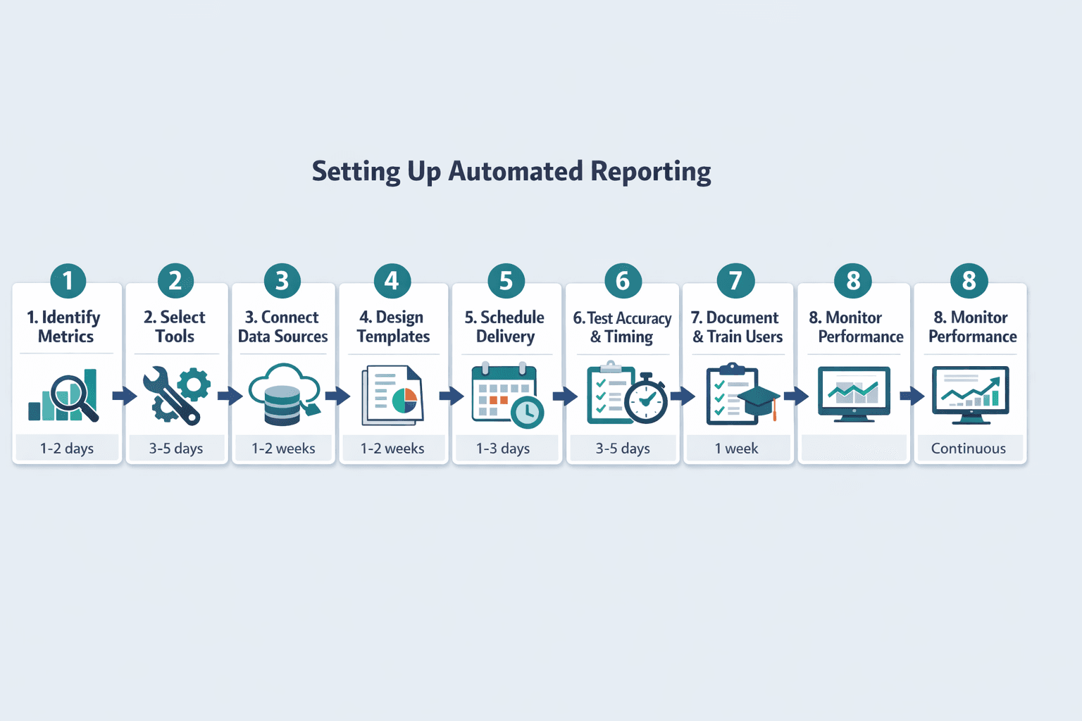
Steps for establishing automated reporting:
- Identify metrics to track (1-2 days): Define which KPIs matter most to stakeholders. Document what each metric means and how it’s calculated.
- Select reporting tools (3-5 days): Evaluate platforms based on data source compatibility, visualization capabilities, and distribution features. IBM’s data preparation guide maps preparation work to the CRISP-DM phases of business understanding, data understanding, and data preparation.
- Connect data sources (1-2 weeks): Establish direct connections to databases, cloud storage, or APIs. Test data quality and refresh reliability.
- Design report templates (1-2 weeks): Build reusable dashboard layouts with standard visualizations. Include filters and drill-down capabilities for stakeholder exploration.
- Schedule automated delivery (1-3 days): Configure report subscriptions with recipients, delivery times, and frequencies that match business rhythms.
- Test accuracy and timing (3-5 days): Validate that reports show correct data, refresh successfully, and reach recipients as expected. Monitor for errors in scheduled deliveries.
- Document processes and train users (1 week): Create documentation explaining what each report shows, how to interpret metrics, and who to contact with questions. Train stakeholders on dashboard navigation and filtering.
- Monitor ongoing performance (continuous): Looker admins use schedule history to troubleshoot scheduled content deliveries and ensure reliability.
Best Practices for Automated Reporting
Automated reporting remains effective only if you maintain quality standards and adapt to changing business needs.
Essential best practices:
- Regular template reviews — Quarterly check-ins with stakeholders to confirm reports still answer the right questions
- Validation checks — Power BI administrators can monitor refresh activity and error messages to catch data quality issues early
- Stakeholder feedback loops — Monthly surveys or check-ins to confirm reports are useful and actionable
- Documentation standards — NIST states that information quality is composed of utility, integrity, and objectivity—document how each metric is calculated and what it means
- Backup processes — Plan for what happens when automated pipelines fail or data sources change
- Performance monitoring — Track dashboard load times, report delivery success rates, and data refresh completion
- Refresh reliability — Power BI alerts only work on refreshed data, so monitor refresh pipelines to avoid false confidence from stale reports
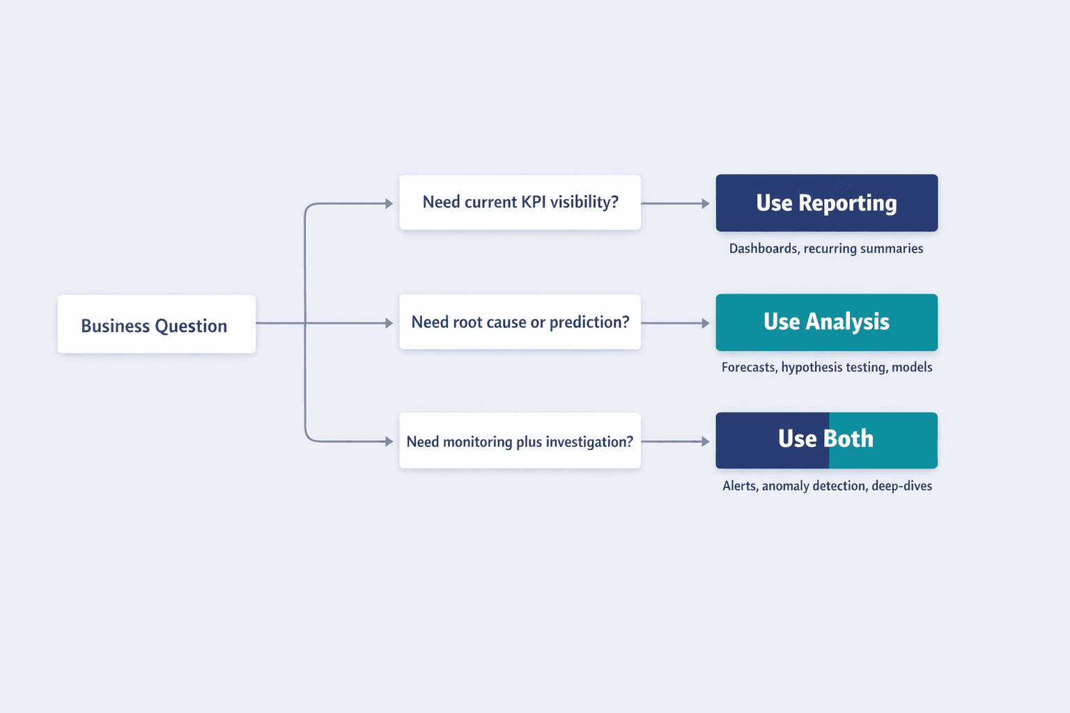
Choosing Between Data Analysis and Reporting
The right approach depends on the business question you’re trying to answer. Forrester’s 2024 survey findings on low trust in measurement suggest organizations should choose reporting when they need shared definitions and consistent visibility, and choose analysis when they need interpretation and causality.
Decision framework:
Question: “What are our current sales numbers?”
→ Use reporting. Standard dashboard showing known metrics.
Question: “Why did sales drop 15% last month?”
→ Use analysis. Investigate drivers, compare segments, test hypotheses.
Question: “Are we meeting our quarterly targets?”
→ Use reporting. Track KPIs against goals on a dashboard.
Question: “Will we hit our annual revenue target at this pace?”
→ Use analysis. Build forecasting model with scenario planning.
Question: “How many support tickets came in this week?”
→ Use reporting. Operational metric tracked on recurring dashboard.
Question: “What factors cause high support ticket volume?”
→ Use analysis. Statistical modeling to identify root causes.
Question: “Which customers are most profitable?”
→ Use both. Reporting shows profitability by customer, analysis reveals patterns that predict profitability.
When to Focus on Reporting
Reporting provides sufficient value without deep analysis when you need consistent monitoring and communication of known metrics. APHIS dashboards illustrate reporting use cases like status monitoring and operational oversight.
Situations requiring reporting:
- Tracking known KPIs — Monitor metrics you’ve already defined as important (revenue, conversion rate, customer count)
- Monitoring operational metrics — USDA’s LCMS dashboard summarizes and generates reports of landscape changes for operational visibility
- Regulatory compliance — Document historical performance for audits and regulatory filings
- Stakeholder updates — Power BI subscriptions deliver scheduled snapshots to executives who need visibility without investigation
- Historical comparisons — Track year-over-year or month-over-month changes in standard metrics
- Operational transparency — Dashboards that give teams visibility into workflows, backlogs, or production status
When to Focus on Analysis
Analysis is necessary when you need to investigate patterns, test hypotheses, or predict outcomes beyond what standard reporting shows. SAS defines analytics as discovering unknown relationships and predicting future outcomes.
Situations requiring analysis:
- Investigating performance changes — Amazon QuickSight anomaly detection surfaces unusual patterns and hidden trends that manual reporting would miss
- Optimizing processes — A/B testing, experimentation, and statistical validation of improvement initiatives
- Testing hypotheses — Validate assumptions about what drives business outcomes using statistical methods
- Forecasting outcomes — IBM’s financial analytics uses large datasets, AI, and scenario modeling to predict future performance
- Discovering new opportunities — Exploratory data analysis to identify customer segments, product trends, or market shifts
- Building predictive models — Create models that score leads, predict churn, or recommend next actions
When to Use Both
Integrated approaches work best when reporting provides continuous visibility and analysis adds strategic insights when metrics change. Power BI’s combination of report subscriptions, alerts, and automatic insights shows how modern platforms blend both capabilities.
Combined reporting and analysis workflows:
- Monthly reports with quarterly deep-dives — Standard dashboards track KPIs continuously, detailed analytical investigations happen quarterly to understand trends and drivers
- Real-time dashboards with ad-hoc investigation capabilities — Power BI data alerts track a KPI continuously, then prompt analysts to investigate why the number changed when thresholds are crossed
- Operational monitoring with root cause analysis — Production dashboards show current status, trigger analysis when anomalies appear to identify causes
- Customer dashboards with predictive scoring — Weekly reports show customer behavior metrics, quarterly analysis builds churn prediction models
- Financial reports with forward-looking forecasts — Amazon QuickSight can show monthly financial performance alongside forecasted trends and scenario modeling
Tools for Data Analytics and Reporting
The technology landscape includes specialized reporting tools, analytics-focused platforms, and integrated solutions that combine both capabilities. IBM distinguishes between BI users needing curated datasets and data scientists needing high-quality data for modeling.
| Category | Examples | Key Features | Ideal Use Cases | Skill Level |
|---|---|---|---|---|
| Pure Reporting Tools | Looker Studio, Crystal Reports | Dashboards, scheduled delivery, visualization | Operational monitoring, stakeholder updates | Beginner to intermediate |
| Pure Analytics Tools | R, Python, SAS, SPSS | Statistical modeling, machine learning, forecasting | Exploratory analysis, predictive modeling | Advanced |
| Integrated Platforms | Power BI, Tableau, Amazon QuickSight | Dashboards + anomaly detection + forecasting | Organizations needing both reporting and analysis | Intermediate to advanced |
Reporting-Focused Tools
Platforms designed primarily for data visualization and report distribution emphasize user-friendly interfaces and automated delivery. Power BI’s subscription and alert features make it a strong reporting tool.
Categories of reporting tools:
- BI dashboards — Power BI, Tableau, Looker Studio Pro for scheduled report delivery, Qlik Sense
- Spreadsheet tools — Excel, Google Sheets for basic charts and pivot tables
- Reporting automation platforms — Crystal Reports, SSRS for enterprise report generation and distribution
- Government and specialized dashboards — USDA LCMS for landscape monitoring, APHIS dashboards for operational oversight
Analytics-Focused Tools
Platforms designed for statistical analysis and data exploration prioritize modeling capabilities over visualization simplicity. SAS’s analytics overview highlights predictive modeling, machine learning, and applied mathematics as core capabilities.
Categories of analytics tools:
- Statistical software — SAS, SPSS, Stata for hypothesis testing and statistical modeling
- Programming languages — Python (pandas, scikit-learn), R (tidyverse, caret) for flexible data manipulation and modeling
- Data science platforms — Jupyter, RStudio, Databricks for collaborative analysis and model building
- Machine learning tools — TensorFlow, PyTorch for deep learning, Amazon QuickSight’s anomaly detection for embedded ML
- Advanced visualization platforms — IBM Cognos with key drivers, decision trees, and relationship exploration
FAQ
What is the main difference between data analytics and data reporting?
Reporting shows what happened using structured presentations of collected data—dashboards, KPI summaries, and scheduled reports. Analytics explains why it happened and what might happen next using statistical methods, predictive modeling, and exploration. Reporting is monitoring, analytics is investigation.
Can you do data analytics without reporting?
Yes, analytics can exist independently when exploring data for insights—a data scientist can analyze raw datasets without any reporting infrastructure. But reporting provides the structured foundation that often identifies which questions need analytical investigation. Most organizations start with reporting to establish baseline visibility, then add analytics when they need to understand drivers and predict outcomes.
Is automated reporting the same as data analytics?
No. Automated reporting is a technical implementation method for distributing reports—scheduled email subscriptions, automatic dashboard refreshes, threshold alerts. Analytics is an investigative process using statistical methods to discover insights. Automation can be applied to reporting infrastructure, but it doesn’t replace the analytical thinking required to interpret patterns and build models.
Which comes first: reporting or analytics?
Reporting typically establishes baseline understanding of metrics, then analytics investigates patterns and anomalies found in those reports. IBM notes that structured data is especially useful for BI systems and reporting processes because it’s organized for quick querying. But the order can vary—exploratory analysis sometimes happens first to determine which metrics are worth tracking in regular reports.
Do I need both data analysis and reporting capabilities?
Most organizations benefit from both—reporting for consistent monitoring and communication, analysis for strategic insights and problem-solving. The balance depends on organizational maturity and goals. Early-stage companies might start with basic reporting and add analytics as questions become more complex. Mature enterprises typically need robust capabilities in both areas, often with integrated platforms that combine automated reporting with embedded analytical features.