How to Write a Data Analysis Report (Template + Examples)
Learn how to write data analysis reports that turn raw numbers into clear insights. This guide covers structure, visualizations, and recommendations—with a downloadable template and real examples.
Quick Verdict
A data analysis report presents findings from data examination in a structured, decision-ready format. It transforms raw numbers into clear insights, complete with visualizations, methodology, and actionable recommendations. Think of it as the bridge between “here’s what the data shows” and “here’s what we should do about it.”
Every effective report includes five core components: an executive summary (the key findings at a glance), methodology (how you analyzed the data), findings (what you discovered), visualizations (charts that make patterns obvious), and recommendations (what to do next). These sections work together to tell a complete story—from question to answer to action.
This guide walks you through the entire process: defining your objective, preparing data, conducting analysis, structuring your report, and avoiding common mistakes. You’ll get a downloadable template, real-world examples from sales and customer research, and best practices borrowed from organizations like the CDC and U.S. Census Bureau.
What Is a Data Analysis Report?
A data analysis report is a document that presents the results of data examination in a structured format designed to support decision-making. It organizes raw data, statistical findings, and expert interpretation into sections that answer a specific question or solve a defined problem. According to IBM’s definition, these reports use facts, metrics, and data to guide strategic business decisions.
Organizations create these reports for business performance reviews, research projects, market analysis, and operational assessments. A retail company might analyze quarterly sales trends, a healthcare provider might examine patient satisfaction survey results, or a marketing team might evaluate website traffic patterns. The U.S. Census Bureau’s methodology documentation shows how formal analysis reports document survey methods, data quality checks, and accuracy measures to support policy and planning decisions.
Effective data analysis reports share several key characteristics:
- Clear structure — Organized into logical sections that guide readers from question to conclusion
- Visual elements — Charts, graphs, and tables that make patterns immediately visible
- Actionable insights — Findings translated into specific recommendations
- Supported conclusions — Claims backed by data with transparent methodology
- Appropriate detail level — Technical depth matched to audience expertise
Purpose and Benefits
Organizations create data analysis reports to make sense of information they already have and turn it into decisions they can actually use. The reports formalize findings so stakeholders can evaluate options, track progress toward goals, and communicate results across teams. IBM notes that customer analytics reports help organizations make informed decisions about customer needs using transactional data, feedback, and geographic patterns.
Here’s what you gain from creating structured analysis reports:
- Informed decision-making — Data-backed choices instead of hunches or guesswork
- Progress tracking — Documented baselines and trends that show whether initiatives are working
- Pattern identification — Trends and correlations that aren’t obvious in raw data
- Stakeholder communication — Shared understanding of findings across technical and non-technical audiences
- Methodology documentation — Transparent process that others can review, replicate, or build on
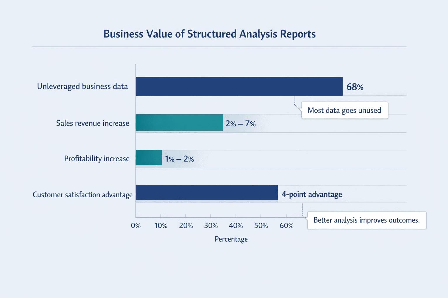
The business impact can be significant. IBM cites McKinsey research showing that organizations delivering strong customer experience increase sales revenue by 2% to 7% and profitability by 1% to 2%—gains that typically start with analysis reports identifying what’s working and what’s not. And here’s a sobering stat: IBM reports that 68% of business data goes unleveraged, meaning most organizations are sitting on insights they never extract. Formal analysis reports are how you change that.
How to Write a Data Analysis Report
Writing a data analysis report follows a structured process from planning through final presentation. You’re essentially translating a pile of data into a story with a clear beginning (the question), middle (the analysis), and end (the recommendations). The CDC’s 2024 Program Evaluation Framework emphasizes clear communication, plain language, and effective visualization for intended audiences—principles that apply whether you’re reporting to executives or technical peers.
Step 1: Define Your Objective and Audience
Start by understanding exactly what question you’re answering and who will read the report. A vague objective like “analyze sales data” leads to unfocused analysis. A clear objective—“determine which product categories drove Q4 revenue growth and identify underperforming regions”—gives you a specific target.
Your audience shapes everything: technical depth, language choice, visualization complexity, even report length. The CDC’s data visualization guidance recommends working with stakeholders upfront to ensure visuals support the key messages they need.
Consider these questions before you start:
- Research question — What specific problem are you solving or question are you answering?
- Stakeholder needs — What decisions will this report inform? What do readers need to know?
- Technical level — Are you writing for analysts, executives, or a mixed audience?
- Desired outcomes — What should readers be able to do after reading this report?
IBM notes that customer analytics can influence marketing, product development, and business strategy—meaning the same dataset might require very different reporting angles depending on whether your audience is the sales team, product managers, or the C-suite.
Step 2: Collect and Prepare Your Data
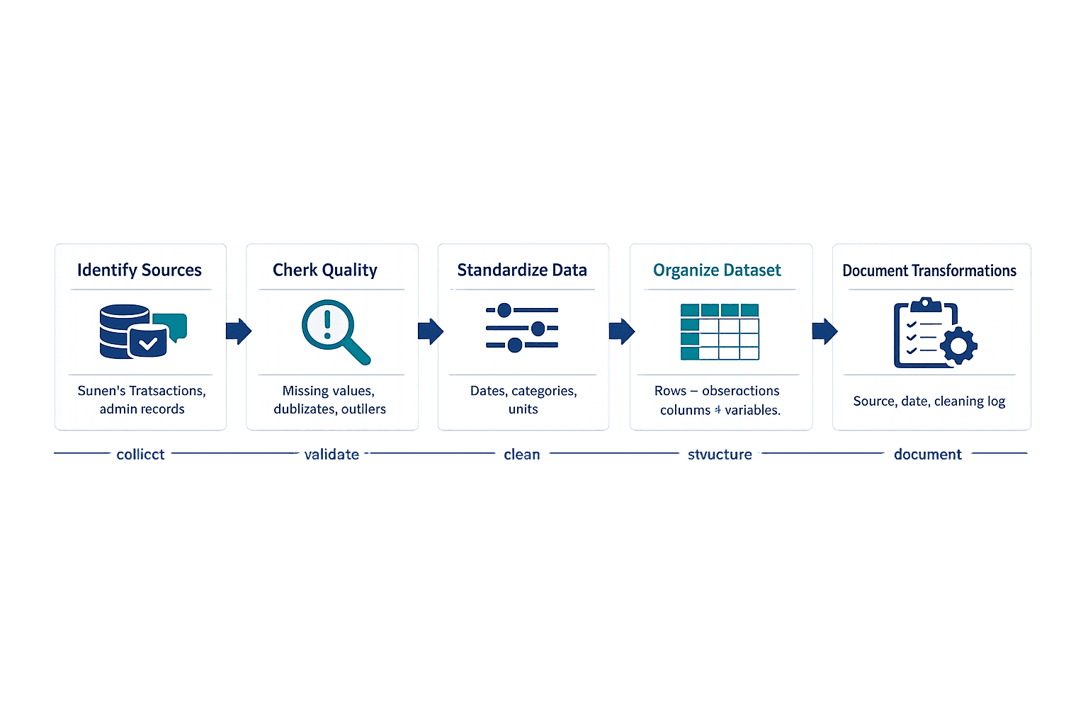
Data preparation is where most analysis actually happens. You’re gathering information from relevant sources, checking quality, and organizing everything so patterns become visible instead of buried in noise.
A 2025 methodological review explains that data cleaning improves validity and accuracy by addressing missing values, outliers, anomalies, and inconsistencies before analysis begins. The U.S. Census Bureau’s Annual Business Survey demonstrates how real-world projects combine survey responses, census records, and administrative data—rarely does analysis rely on a single clean dataset.
Here are the core preparation tasks:
- Identify sources — Determine where your data comes from and whether it’s complete enough to answer your question
- Ensure data quality — Check for missing values, duplicates, formatting errors, and outliers that could skew results
- Remove inconsistencies — Standardize date formats, fix typos in categorical fields, align units of measurement
- Organize datasets — Structure data so it’s analysis-ready (columns for variables, rows for observations)
- Document sources — Keep a record of where data came from, when it was collected, and any transformations applied
The Census Bureau’s 2026 user note on 2024 SIPP data is a cautionary example: low response rates led to item response and coverage issues that didn’t meet quality standards. Assessing data quality before analysis prevents you from drawing strong conclusions from weak foundations.
Step 3: Conduct Your Analysis
This is where you examine data to find patterns, relationships, and insights that answer your research question. The methods you choose depend on what you’re trying to learn—trends over time require different techniques than group comparisons or correlation studies.
IBM’s diagnostic analytics overview identifies correlation analysis, regression modeling, and cohort analysis as common techniques for understanding performance drivers. IBM’s dataset documentation also lists hypothesis testing as a method for validating theories and supporting evidence-based decisions.
Common analysis methods include:
- Descriptive statistics — Means, medians, ranges, and distributions that summarize your data
- Trend analysis — Patterns over time (monthly sales growth, seasonal fluctuations)
- Comparative analysis — Differences between groups (regional performance, demographic segments)
- Correlation studies — Relationships between variables (does web traffic correlate with sales?)
- Segmentation — Grouping data by meaningful categories (customer types, product lines)
- Hypothesis testing — Statistical validation of whether observed patterns are significant or likely due to chance
IBM notes that text mining and sentiment analysis can be used for customer feedback analysis and market research, broadening analysis beyond traditional numeric statistics into qualitative patterns from reviews, support tickets, or social media.
Step 4: Structure Your Report
Most data analysis reports follow a standard structure that guides readers from context through findings to recommendations. This isn’t arbitrary—the sequence mirrors how people naturally process new information: background first, methods next, then results, then interpretation.
The Georgia ERS Experience Investigation Report uses exactly this structure: executive summary up front, followed by detailed results, analysis, and recommendations. The ACS Design and Methodology Report separates background, methodology, quality documentation, and technical details into clearly navigable sections for different reader needs.
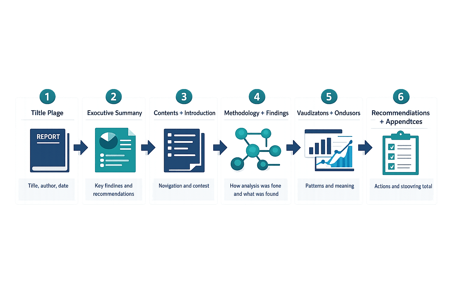
Essential sections in order:
- Title page — Report title, author, date, and distribution list
- Executive summary — Key findings and recommendations in 1-2 pages (write this last)
- Table of contents — Section headings with page numbers for easy navigation
- Introduction/background — Context for why this analysis matters and what question it answers
- Methodology — How you collected and analyzed data (tools, techniques, sample sizes)
- Findings/results — What the data shows, organized by theme or research question
- Data visualizations — Charts and tables that make patterns immediately clear
- Conclusions — What the findings mean and how they answer your research question
- Recommendations — Specific, actionable next steps based on your conclusions
- Appendices — Supporting details, full datasets, technical notes for interested readers
McKinsey’s executive-summary-led publications show a common business convention: senior readers often consume the summary before (or instead of) the full report, which is why it sits near the front even though you write it last.
Step 5: Write the Executive Summary
The executive summary provides key findings and recommendations at a glance so stakeholders can understand your conclusions without reading the entire document. Think of it as the report’s “trailer”—it covers the main question, the most important findings, and what you recommend doing about them.
The Georgia ERS report explicitly separates its executive summary from detailed results while hitting all three beats: what we studied, what we found, what we recommend. McKinsey regularly publishes standalone executive summaries for larger reports, reinforcing the best practice that a summary should let senior stakeholders grasp key findings quickly.
Include these elements:
- Main question — The specific problem or objective your analysis addresses
- Key findings — The 3-5 most important discoveries from your data (not everything, just what matters most)
- Critical insights — What those findings mean in context
- Primary recommendations — The top actions stakeholders should consider
- Length guidance — Keep it to 1-2 pages maximum; this is a summary, not a second full report
Write this section last, after you’ve completed your analysis and know exactly what you found. The CDC’s plain-language guidance is relevant here: executive summaries are often read by nontechnical stakeholders, so avoid jargon and write for comprehension rather than showing off technical expertise.
Step 6: Present Your Findings with Visualizations
Present your findings clearly using both narrative explanation and visual elements that make patterns immediately obvious. Good visualizations don’t just decorate the report—they communicate specific insights faster than text alone.
The CDC’s COVE visualization gallery explains that bar charts show comparisons between time periods or categories, while box-and-whisker plots show distributions. Choose chart types based on what you’re trying to communicate, not just what looks familiar. CDC’s planning guidance says analysts should ensure visualizations support key messages rather than including charts just because the data exists.
Best practices for presenting findings:
- Choose appropriate chart types — Bar charts for comparisons, line charts for trends, scatter plots for correlations
- Label clearly — Every axis, data series, and unit should be immediately understandable
- Highlight key insights — Use color, annotations, or callouts to draw attention to what matters
- Provide context — Include benchmarks, targets, or prior-period comparisons so readers can judge significance
- Maintain consistency — Use the same color scheme, fonts, and layout throughout the report
- Explain what the data shows — Don’t assume visualizations speak for themselves; add a sentence interpreting each chart
A peer-reviewed article on data visualization notes that many figures across disciplines are incorrect or suboptimal, with bar plots being a frequent problem. The mistake is choosing familiar chart types by habit rather than thinking about what visual form best communicates your specific insight.
Step 7: Draw Conclusions and Make Recommendations
This section interprets your findings and translates them into actionable recommendations. You’ve shown what the data says—now explain what it means and what stakeholders should do about it.
The CDC Program Evaluation Framework ties findings to action by emphasizing clear communication and effective visualization to support use. The Georgia ERS report shows how formal reports move from evidence to decision-ready guidance rather than stopping at descriptive findings.
Guidelines for strong conclusions and recommendations:
- Base conclusions on data — Every claim should trace back to specific findings in your analysis
- Acknowledge limitations — If your data has gaps, small sample sizes, or quality issues, say so
- Prioritize recommendations — List the most impactful or urgent actions first
- Make them specific and actionable — “Improve customer satisfaction” is vague; “Add live chat support to reduce response time from 24 hours to under 2 hours” is actionable
- Link back to objectives — Show how your recommendations directly address the original research question
The Census Bureau’s SIPP user note is a strong example of acknowledging limitations: when data quality limitations were serious enough, they published a formal caution rather than overstating conclusions. Credibility matters more than confident-sounding claims built on shaky data.
Step 8: Review and Refine
Review your report for accuracy, clarity, and completeness before distribution. This step catches calculation errors, unclear wording, logical gaps, and formatting inconsistencies that weaken your work.
The ACS Accuracy of the Data 2024 documentation shows how major data producers formally document sampling error, nonsampling error, and reliability checks before release. The Annual Business Survey methodology notes that quality control techniques verify operations, processes, and methods—principles that apply to your own review process.
Review checkpoints:
- Verify calculations — Double-check formulas, totals, percentages, and statistical results
- Check for errors — Typos, broken references, mislabeled charts, inconsistent terminology
- Ensure logical flow — Each section should connect naturally to the next
- Confirm visualizations are clear — Ask a colleague if charts are immediately understandable without explanation
- Get peer review — Have someone unfamiliar with the project read it and flag confusing sections
- Proofread — Grammar, spelling, formatting consistency
A 2025 data cleaning review recommends using structured checking frameworks across integrity, consistency, accuracy, and completeness. Turn review into a repeatable checklist rather than an ad hoc skim—you’ll catch more issues and build confidence in your final product.
Data Analysis Report Template
This template provides a ready-to-use structure that adapts to different analysis types—whether you’re reporting sales performance, survey results, or operational metrics. Copy the sections below and fill them with your own data, findings, and recommendations.
Template Structure
| Section Name | Purpose | Key Elements |
|---|---|---|
| Title Page | Identify the report and establish context | Report title, author(s), date, distribution list, confidentiality level |
| Executive Summary | Present key findings and recommendations at a glance | Main question, 3-5 key findings, primary insights, top recommendations (1-2 pages max) |
| Table of Contents | Help readers navigate to specific sections | Section headings with page numbers, clickable links in digital versions |
| Introduction | Explain why this analysis matters and what it covers | Background context, research question, scope and limitations, report structure preview |
| Methodology | Document how you conducted the analysis | Data sources, collection methods, sample sizes, analytical techniques, tools used |
| Findings | Present what the data shows | Results organized by theme or question, supporting statistics, comparisons to benchmarks |
| Visualizations | Make patterns and trends immediately visible | Charts, graphs, tables with clear labels, annotations highlighting key insights |
| Conclusions | Interpret what the findings mean | Summary of main discoveries, connections between findings, assessment of data quality |
| Recommendations | Translate insights into actionable next steps | Prioritized list of specific actions, expected outcomes, implementation considerations |
| Appendices | Provide supporting details for interested readers | Raw data tables, detailed calculations, technical notes, data dictionary, source documentation |
The ACS Design and Methodology Report demonstrates modular report design, separating background, methodology, quality documentation, and technical appendices so different audiences can navigate to what they need. The Georgia ERS report offers a contemporary model for executive summary, findings, analysis, and recommendations as distinct sections.
Downloadable Template Components
Use these structural elements when building your report:
- Executive summary format — One-page template with sections for objective, key findings (bullet points), insights, and top 3 recommendations
- Findings section structure — Organize by research question or theme, with each subsection following the pattern: heading → summary statement → supporting data → visualization → interpretation
- Visualization placement guidelines — Position charts immediately after the text that references them; include a caption explaining what the visual shows
- Conclusion framework — Start with “Based on this analysis…” then list main discoveries, acknowledge limitations, and bridge to recommendations
- Recommendation template — For each recommendation, state the action, explain why it matters based on your findings, and estimate the expected impact
CDC’s guidance on presenting multiple metrics suggests using separate visualizations, filtered single visuals, tooltip layers, or combo charts depending on complexity. CDC’s visualization planning page recommends including standardized prompts for key message, audience, data source, and chart rationale before inserting visuals.
Data Analysis Report Example
This section shows how different organizations apply data analysis reporting principles in practice. The examples demonstrate structure, visualization choices, and how findings translate into recommendations.
Example 1: Sales Performance Analysis Report
Context: A retail company analyzes quarterly sales data to identify growth drivers and underperforming regions.
Key features of this example:
- Objective stated upfront — “Determine which product categories drove Q4 revenue growth and identify regions requiring strategic intervention”
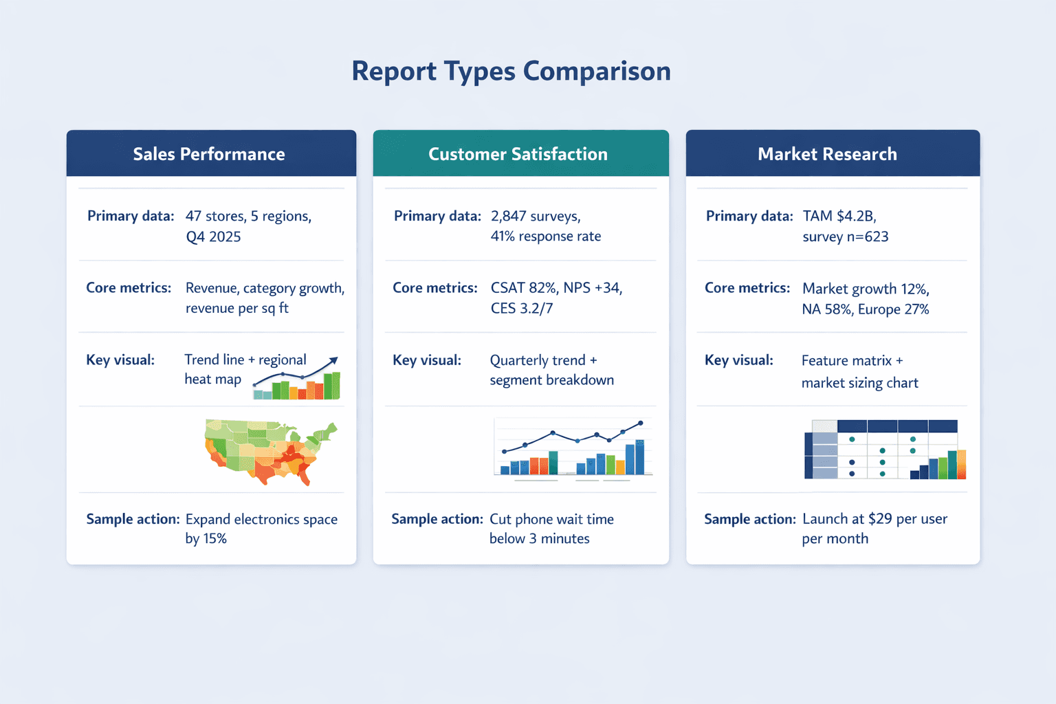
- Methodology outlined — Point-of-sale data from 47 stores across 5 regions, October-December 2025, compared against Q4 2024 and internal targets
- Sales trends visualized — Line chart showing month-over-month revenue by category, with annotations highlighting Black Friday spike and post-holiday plateau
- Regional comparisons — Heat map displaying revenue per square foot by region and store, making underperformers immediately visible
- Actionable recommendations — Specific proposals like “Expand electronics floor space in Northeast region by 15% based on 34% year-over-year growth in that category”
IBM notes that organizations use data-driven analysis to identify price points and product strategies that drive profitability. IBM’s diagnostic analytics page gives an example of checking whether higher website traffic correlates with increased sales—the kind of correlation you’d explore in a thorough sales analysis.
Example 2: Customer Satisfaction Analysis Report
Context: A service company analyzes survey results to understand satisfaction trends and improvement opportunities.
Key features:
- Survey methodology — CSAT survey sent to 2,847 customers post-interaction, 41% response rate, fielded January-March 2026
- Satisfaction metrics — Overall CSAT score of 82% (percentage giving 4 or 5 out of 5), Net Promoter Score of +34, Customer Effort Score of 3.2/7
- Demographic breakdown — Cross-tabulated satisfaction by customer segment (enterprise vs. SMB), service tier, and support channel
- Trend analysis over time — Quarterly CSAT comparison showing 6-point improvement since implementing live chat in Q3 2025
- Improvement recommendations — Prioritized list including “Reduce phone support wait time from 8 minutes to under 3 minutes” based on correlation between wait time and low CSAT scores
IBM’s customer analytics overview explains common satisfaction metrics including CSAT, NPS, and CES, defining CSAT as the share of respondents giving a 4 or 5 out of 5. IBM’s 2025 Adobe-partnered research found that organizations successfully decoding customer intent report 13% lower acquisition costs and a 4-point advantage in customer satisfaction scores—showing the business impact of this type of analysis. That same research reports companies lose an average of $29 million annually when they can’t react quickly to customer demands, making timely satisfaction reporting financially significant.
Example 3: Market Research Analysis Report
Context: A software company analyzes competitive positioning and market trends before launching a new product tier.
Key features:
- Market overview — Total addressable market sized at $4.2B, growing 12% annually, with concentration in North America (58%) and Europe (27%)
- Competitive positioning data — Feature comparison matrix across 8 competitors, pricing analysis showing $15-45/user/month range for similar tools
- Consumer behavior insights — Survey data (n=623) revealing that 67% of target customers prioritize integration capability over advanced features
- Opportunity identification — Gap analysis showing underserved mid-market segment willing to pay 30% premium for better onboarding support
- Strategic recommendations — Launch at $29/user/month positioning between budget and enterprise tiers, invest in integration partnerships with Salesforce and HubSpot
IBM’s text mining documentation explains that sentiment analysis can improve market research and competitive intelligence by analyzing social media and customer text at scale. IBM notes that customer profiling helps organizations pinpoint market gaps or areas for product improvement. IBM’s customer analytics overview lists feedback, support, transactional, and demographic data as relevant sources—showing that market research reports often combine multiple datasets rather than relying on a single survey.
What Makes These Examples Effective
All three examples share characteristics that make analysis reports credible and useful. They state clear objectives upfront rather than burying the research question halfway through. They use visualizations deliberately—each chart supports a specific insight instead of just displaying data because it exists. And they translate findings into specific, actionable recommendations rather than ending with vague conclusions.
Common success factors:
- Clear objectives — Each report answers a specific question that stakeholders care about
- Appropriate visualizations — Chart types match the analytical purpose (trends over time use line charts, group comparisons use bar charts)
- Data-driven conclusions — Every recommendation traces back to specific findings rather than opinion
- Specific recommendations — Actionable next steps with measurable targets, not generic advice
- Professional formatting — Consistent styling, clear headings, and logical information hierarchy
CDC’s visualization planning guidance emphasizes aligning visuals with key messages, supporting the claim that effective examples do more than display data—they use presentation choices to reinforce the report’s purpose. The CDC Program Evaluation Framework recommends simple, audience-appropriate communication and effective data visualization—reinforcing that professional formatting and clarity are part of what makes reports successful.
Best Practices for Data Analysis Reports
These principles improve report effectiveness and impact regardless of topic or industry.
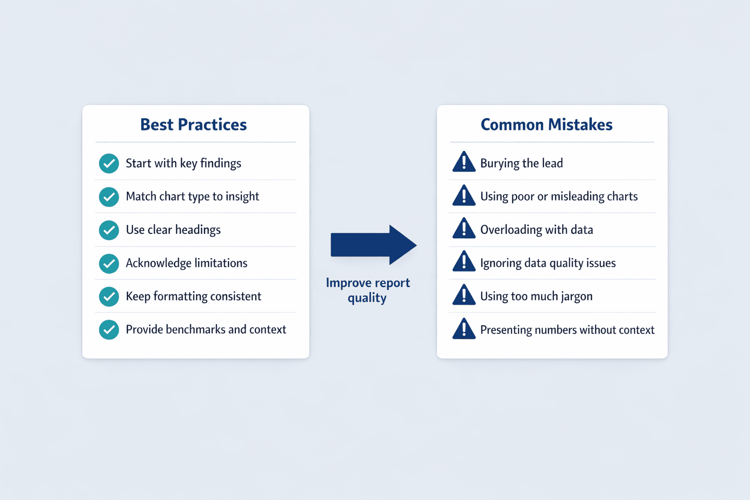
- Know your audience — Adjust technical depth, terminology, and detail level based on who’s reading
- Start with key findings — Put the most important conclusions upfront; don’t make readers dig through methodology to learn what you discovered
- Use clear headings — Descriptive section titles help readers navigate and find what they need quickly
- Choose visualizations carefully — Every chart should communicate a specific insight; if it doesn’t add value, cut it
- Tell a story with data — Connect findings into a narrative flow rather than presenting disconnected statistics
- Be objective — Present what the data shows even when it contradicts expectations or preferences
- Acknowledge limitations — Transparent about data quality issues, sample size constraints, or methodology gaps builds credibility
- Keep it concise — Respect your readers’ time by cutting filler and getting to the point
- Use consistent formatting — Fonts, colors, spacing, and chart styles should be uniform throughout
- Provide context — Include benchmarks, prior periods, or industry standards so readers can judge significance
CDC’s plain-language guidance supports clear headings, reduced jargon, and writing for comprehension over technical showmanship. The CDC’s 2024 Program Evaluation Framework recommends clear, culturally responsive communication and effective visualization—principles that cross from public health into business reporting. Tableau’s best-practices guidance is a strong vendor source for choosing the right visual form, reducing clutter, and designing for fast comprehension.
A peer-reviewed visualization article argues that visuals should help tell the story of the data rather than just decorating the page—directly supporting the best practice of using visualizations purposefully rather than reflexively.
Common Mistakes to Avoid
These pitfalls weaken data analysis reports and undermine credibility.
- Overloading with data — Including every statistic you calculated rather than focusing on what answers your research question
- Poor visualizations — Wrong chart types for the data, unlabeled axes, misleading scales, or cluttered designs
- Burying the lead — Making readers wade through pages of background before revealing key findings
- Lack of clear recommendations — Stopping at “here’s what we found” without explaining “here’s what we should do”
- Ignoring limitations — Overstating conclusions from incomplete or low-quality data
- Inconsistent formatting — Mixing fonts, colors, and styles that make the report look unpolished
- Too much technical jargon — Using specialized terminology without explanation when writing for mixed audiences
- Missing context — Presenting numbers without benchmarks, comparisons, or explanation of significance
The peer-reviewed data visualization article specifically notes that bar plots remain one of the most common problems in scientific visualization—people default to familiar chart types by habit rather than choosing what best communicates their insight. The 2025 data-cleaning review warns that missing values, outliers, and inconsistent data can bias conclusions if not handled before analysis.
The Census Bureau’s 2026 SIPP note is a current cautionary example: response-rate and coverage problems undermined data quality, illustrating why you shouldn’t overstate conclusions from weak foundations. CDC plain-language guidance supports the warning against excessive jargon and dense prose, especially when reports reach mixed audiences.
FAQ
What Is an Analysis Report Example?
An analysis report example is a sample or model that demonstrates how to structure and present findings from data examination. It shows the complete flow from research question through methodology, findings, and recommendations.
Common types of analysis report examples include sales reports showing revenue trends by product or region, customer satisfaction surveys presenting survey results and improvement recommendations, marketing performance reports analyzing campaign effectiveness, research findings documenting scientific or academic studies, and operational reviews examining process efficiency. IBM’s data-driven decision-making overview names monthly sales reports, customer satisfaction surveys, and website traffic analyses as typical outputs.
Analysis report examples typically include:
- Clear problem statement — The specific question the analysis addresses
- Data presentation — Tables, charts, and statistics organized logically
- Visual aids — Graphs that make patterns immediately obvious
- Conclusions and recommendations — Interpretation of what the data means and what actions stakeholders should take
IBM’s customer analytics page outlines common report ingredients like CSAT metrics, NPS scores, feedback analysis, demographic breakdowns, and stakeholder-facing interpretation. The ACS Design and Methodology Report provides a non-commercial example showing how formal analysis reports present problem context, methods, supporting findings, and documentation—useful for understanding that strong examples aren’t limited to business contexts.