How to Write a KPI Report (Step-by-Step)
Learn how to write KPI reports that drive decisions: define objectives, select metrics, gather data, analyze performance, and document insights—without turning into data dumps.
Quick Verdict
A KPI report is a structured document that shows whether business objectives are being met through measurable metrics. It translates raw data—like sales numbers, website traffic, or customer retention rates—into clear insights about performance.
Why bother with formal KPI reporting? Because numbers alone don’t drive decisions. A KPI report connects metrics to outcomes, highlights what’s working (and what isn’t), and gives stakeholders the context they need to act. According to IBM, KPIs measure success toward strategic goals—they’re not just data points, they’re progress checks.
This guide walks through the complete process: defining objectives, selecting the right metrics, gathering data, analyzing performance, visualizing results, and documenting insights. Whether you’re reporting to executives or tracking team goals, you’ll learn how to create reports that actually get used.
How to Write a KPI Report
Writing a KPI report comes down to six core steps: define your business objectives, select relevant KPIs that measure those objectives, gather accurate data, analyze performance against targets, create visual representations, and document insights with recommendations. Skip any of these and your report becomes either vague, irrelevant, or unactionable.
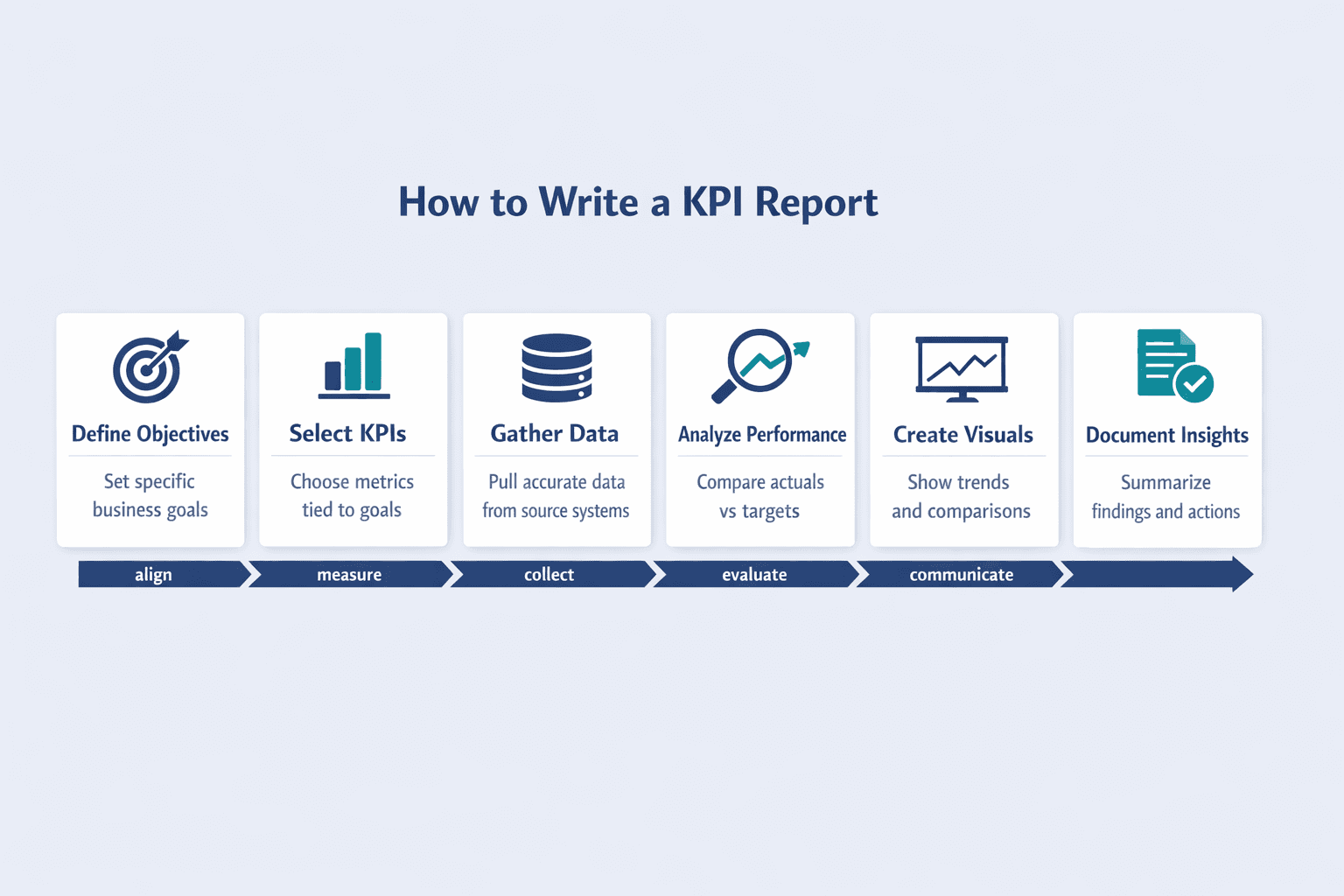
Step 1: Define Your Business Objectives
Start with objectives, not metrics. KPIs only matter when they measure progress toward something specific. If your objective is “grow revenue,” you’ll track different metrics than if it’s “improve customer retention” or “reduce operational costs.”
Common business objectives across departments include:
- Increase sales revenue by 20% year-over-year
- Reduce customer churn rate to below 5%
- Improve website conversion rate to 3.5%
- Launch three new product features per quarter
- Decrease average support ticket resolution time to under 2 hours
Objectives should be specific and measurable. Asana recommends making goals SMART: specific, measurable, achievable, realistic, and time-bound. “Improve customer satisfaction” is too vague—“increase NPS from 42 to 50 within six months” is actionable.
Step 2: Select Relevant KPIs
Once objectives are clear, choose metrics that directly measure progress. Not every metric deserves KPI status—IBM notes that KPIs are distinguished from general metrics by their link to strategic goals.
Effective KPIs are:
- Measurable — quantifiable with clear data sources
- Relevant — directly tied to your defined objective
- Time-bound — tracked over consistent periods
- Actionable — changes in the metric should suggest next steps
- Impactful — moving this metric matters to business outcomes
- Comparable — can be measured against targets or benchmarks
Here’s how common objectives map to KPIs:
| Business Objective | Recommended KPI | Measurement Method |
|---|---|---|
| Increase revenue | Monthly recurring revenue (MRR) | Financial system |
| Improve conversion | Conversion rate (%) | Analytics platform |
| Reduce churn | Customer retention rate (%) | CRM |
| Boost engagement | Weekly active users (WAU) | Product analytics |
| Optimize support | Average resolution time | Ticketing system |
Salesforce’s dashboard guide lists concrete sales KPI examples including conversion rate, quota attainment, pipeline opportunities, and customer retention rate—useful starting points when building your KPI set.
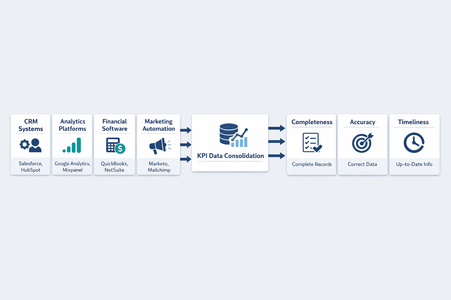
Step 3: Gather Your Data
Data collection is straightforward if you’ve already defined what you’re measuring. Most KPIs pull from existing business systems—the trick is ensuring consistency and quality.
Common data sources include:
- CRM systems (Salesforce, HubSpot) — customer data, pipeline, deals
- Analytics platforms (Google Analytics, Mixpanel) — website and product metrics
- Financial software (QuickBooks, NetSuite) — revenue, expenses, budgets
- Marketing automation (Marketo, Mailchimp) — campaign performance
- Support platforms (Zendesk, Intercom) — tickets, response times
- HR systems (BambooHR, Workday) — headcount, turnover, engagement
Data quality matters more than volume. The CDC identifies completeness, accuracy, and timeliness as the three basic characteristics of high-quality data. Incomplete records, outdated exports, or mismatched definitions will undermine your entire report.
Step 4: Analyze Performance Against Targets
Raw numbers mean nothing without context. Analysis compares actual results to benchmarks, targets, or historical performance to determine whether you’re on track.
Common analysis approaches:
- Target vs. actual — Did we hit 100 new customers (target) or only 87 (actual)?
- Period-over-period comparison — How does this month compare to last month? This quarter vs. last quarter?
- Trend analysis — Is the metric moving up, down, or staying flat over time?
- Variance analysis — What’s the gap between expected and actual performance, and why?
Tableau recommends comparing across time frames like week-over-week, month-over-month, and year-over-year to spot patterns and seasonal effects. A single data point tells you where you are—trend lines tell you where you’re going.
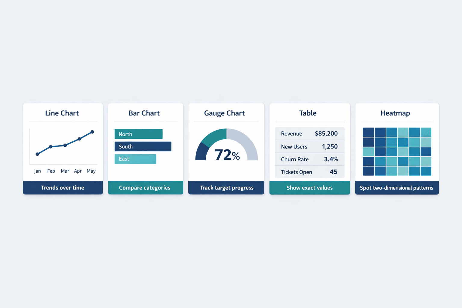
Step 5: Create Visual Representations
Visualizations make performance trends scannable. Instead of reading “revenue increased 14.2% MoM for three consecutive months,” a stakeholder sees an upward-trending line chart instantly.
Effective visualization types for KPI reports:
- Line charts — Show trends over time (monthly revenue, traffic growth). Microsoft notes these are ideal for visualizing performance across periods.
- Bar charts — Compare categories or time periods side-by-side (regional sales, channel performance)
- Gauge charts — Display progress toward a target (72% of quarterly goal achieved)
- Tables — Present detailed breakdowns when exact values matter
- Heatmaps — Highlight patterns across two dimensions (time of day vs. day of week)
But don’t overdo it. Power BI’s design guidance cautions that too many chart types, colors, or data series reduce clarity. Simple, consistent visuals beat flashy complexity.
Step 6: Document Insights and Recommendations
Visuals show what happened—narrative explains why and what to do next. This is where KPI reports go from data dump to decision tool.
Every report should include:
- Executive summary — 2-4 sentences on headline performance and critical actions
- Key findings — What changed, what worked, what didn’t
- Performance drivers — Why metrics moved (campaign launch, seasonal dip, product bug)
- Recommendations — Specific next steps based on findings
- Action owners — Who’s responsible for follow-up
Tableau Research’s 2025 analysis of 25,000 dashboards found text blocks are critical for making dashboards useful—numbers need context. The CDC emphasizes that performance metrics should identify both successes and areas for process improvement, not just report status.
What to Include in a KPI Report
A complete KPI report balances structure with clarity. Too sparse and stakeholders lack context; too detailed and key insights get buried.
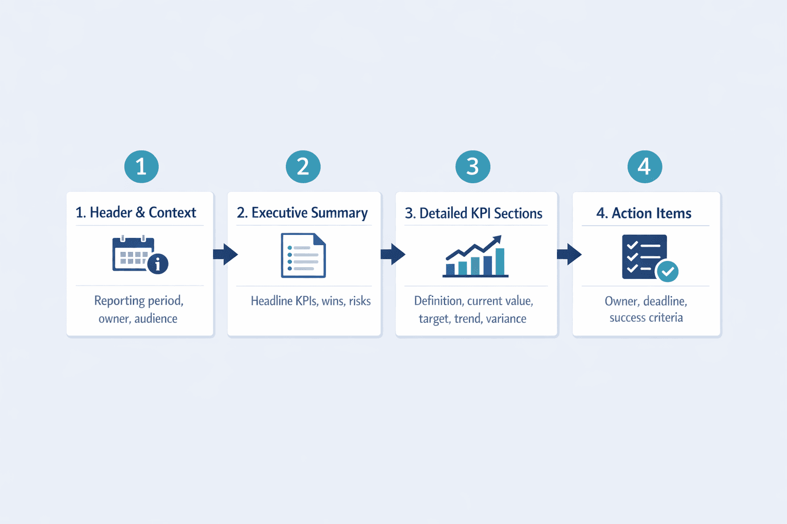
Report Header and Context
Every report needs metadata upfront:
- Reporting period — What timeframe does this cover? (Q1 2026, March 2026, Week of May 12)
- Report date — When was this generated?
- Department or function — Sales, marketing, product, operations?
- Report owner — Who compiled this and who to contact for questions
- Target audience — Executive team, department heads, individual contributors
Tableau recommends clearly showing data sources and update timestamps so users understand what they’re looking at and how current it is.
Executive Summary
The executive summary distills the entire report into a scannable snapshot. Think of it as the “if you only read one thing” section.
Include:
- Headline metrics — Top 2-3 KPIs with current values and direction (up/down)
- Major wins — What exceeded expectations
- Key concerns — What’s off-track or declining
- Critical actions needed — Must-do items with owners and deadlines
Keep this section to 3-5 bullet points max. Tableau defines executive dashboards as visualizations of crucial metrics for leadership—the summary should support fast, confident decision-making.
Detailed KPI Sections
For each KPI, provide enough detail to understand performance without overwhelming the reader.
Structure each section with:
- Metric name and definition — What exactly are we measuring? How is it calculated?
- Current value — Latest data point with clear units (%, $, count)
- Target value — What were we aiming for?
- Trend direction — Up, down, flat? Show a sparkline or small chart if helpful
- Variance explanation — Why did we exceed or miss the target?
- Context — Historical comparison, industry benchmarks, relevant events
IBM explains that clear metric definitions help teams identify what to collect and monitor—don’t assume everyone interprets “conversion rate” or “active users” the same way.
Action Items and Next Steps
Data without action is just trivia. End each report with concrete next steps tied to findings.
Translate insights into:
- Specific actions — “Launch retargeting campaign for cart abandoners” beats “improve conversions”
- Owners — Who’s responsible for each action?
- Deadlines — When will this be completed?
- Success criteria — How will we know it worked?
The CDC notes that performance metrics should identify areas for process improvement—reports should close with recommendations, not observations.
KPI Report Best Practices
Good KPI reports balance comprehensiveness with focus. Here’s what makes them effective:
- Keep it focused on 5-10 key metrics — More KPIs = less clarity. Tableau emphasizes identifying the most important elements for your audience rather than showing everything available.
- Use consistent formatting — Same fonts, colors, chart types across reports. Consistency builds trust and speeds comprehension.
- Update on a regular schedule — Weekly, monthly, or quarterly—match the cadence to decision cycles and data availability.
- Tailor to your audience — Executives need summaries; department heads need detail; analysts need methodology.
- Include context for anomalies — If a metric spiked or dropped, explain why—don’t leave stakeholders guessing.
- Highlight trends, not just snapshots — Show where metrics are heading, not just where they are today.
- Make insights scannable — Use bolding, subheads, and white space so readers can skim and still get value.
- Provide historical comparison — “Revenue hit $500K” means nothing without knowing last month was $450K or $550K.
Power BI’s design tips warn against clutter and mixing measures with very different scales on the same chart—clarity beats completeness.
Common KPI Report Formats
Different formats suit different audiences and use cases. Choose based on how often stakeholders need updates and how they’ll consume the information.
| Format | Best Use Case | Typical Audience | Update Frequency |
|---|---|---|---|
| Interactive dashboard | Real-time monitoring, self-service exploration | Analysts, department heads | Continuous (live data) |
| Slide deck | Executive reviews, board meetings | C-suite, board members | Monthly or quarterly |
| PDF or document | Detailed analysis, compliance reporting | Cross-functional teams | Monthly or quarterly |
| Email digest | Quick status updates, operational metrics | Team members, managers | Daily or weekly |
Tableau’s marketing dashboard whitepaper describes a dashboard shared in monthly department meetings—proving that even live dashboards can be used on a scheduled cadence rather than replacing formal reporting entirely.
Tools for Creating KPI Reports
The right tool depends on your data sources, technical skills, and reporting needs.
Spreadsheet software:
- Excel, Google Sheets — Manual but flexible; good for small teams or ad hoc reports
Business intelligence platforms:
- Tableau — Visual analytics with connected data, interactive dashboards
- Power BI — Microsoft’s BI tool with strong Excel integration and enterprise features
Dashboard tools:
- Databox, Klipfolio — Pre-built connectors for common data sources, template-based reporting
Analytics platforms:
Reporting automation:
- Looker, Domo — Centralized data modeling with scheduled report delivery
Most organizations use a combination—Google Sheets for one-off analysis, Tableau for executive dashboards, and email digests for weekly operational updates.
Frequently Asked Questions
How often should KPI reports be created?
Reporting frequency depends on the metric and decision cycle. Weekly reports suit operational metrics like sales pipeline or support tickets. Monthly reports work for tactical reviews—team performance, campaign results. Quarterly reports fit strategic assessments like product roadmap progress or annual goals.
Tableau notes that KPI dashboards can monitor performance in real time and support comparisons across week-over-week, month-over-month, and year-over-year time frames. But real-time access doesn’t replace formal reporting—it complements it. The CDC’s surveillance guidance treats timeliness as a primary data quality indicator, meaning reporting frequency should match how quickly reliable data becomes available.
How many KPIs should be in a report?
Stick to 5-10 KPIs per report. More than that and focus dilutes—stakeholders won’t remember what matters most.
Too many metrics also reduce readability. Microsoft warns that overly busy charts with many data series hurt both comprehension and performance. If you’re tracking 20+ metrics, break them into multiple reports by theme (sales KPIs, marketing KPIs, product KPIs) rather than cramming everything into one massive document.
What’s the difference between a KPI and a metric?
All KPIs are metrics, but not all metrics are KPIs. IBM defines KPIs as metrics tied to strategic goals. Metrics measure any activity or outcome—page views, email opens, support tickets. KPIs measure progress toward objectives that matter to the business.
For example, “total website traffic” is a metric. “Conversion rate from trial signup to paid customer” is a KPI if your strategic objective is revenue growth. IBM’s sales metrics guide explains that a sales metric can become a KPI depending on how it’s used—context determines whether a number is just data or a key performance indicator.
Frequently Asked Questions
How often should KPI reports be created?
Reporting frequency depends on the metric and decision cycle. Weekly reports suit operational metrics like sales pipeline or support tickets. Monthly reports work for tactical reviews—team performance, campaign results. Quarterly reports fit strategic assessments like product roadmap progress or annual goals.
Tableau notes that KPI dashboards can monitor performance in real time and support comparisons across week-over-week, month-over-month, and year-over-year time frames. But real-time access doesn’t replace formal reporting—it complements it. The CDC’s surveillance guidance treats timeliness as a primary data quality indicator, meaning reporting frequency should match how quickly reliable data becomes available.
How many KPIs should be in a report?
Stick to 5-10 KPIs per report. More than that and focus dilutes—stakeholders won’t remember what matters most.
Too many metrics also reduce readability. Microsoft warns that overly busy charts with many data series hurt both comprehension and performance. If you’re tracking 20+ metrics, break them into multiple reports by theme (sales KPIs, marketing KPIs, product KPIs) rather than cramming everything into one massive document.
What's the difference between a KPI and a metric?
All KPIs are metrics, but not all metrics are KPIs. IBM defines KPIs as metrics tied to strategic goals. Metrics measure any activity or outcome—page views, email opens, support tickets. KPIs measure progress toward objectives that matter to the business.
For example, “total website traffic” is a metric. “Conversion rate from trial signup to paid customer” is a KPI if your strategic objective is revenue growth. IBM’s sales metrics guide explains that a sales metric can become a KPI depending on how it’s used—context determines whether a number is just data or a key performance indicator.