KPI Report Examples: Real-World Samples
See real KPI report examples across sales, marketing, finance, operations, customer service, project management, and executive dashboards—with the exact metrics, targets, and formatting that drive action.
Quick Verdict
A KPI report is a document that tracks key performance indicators—measurable values showing how well your organization performs against its goals. Think of it as your business’s vital signs dashboard: revenue, customer satisfaction, project timelines, and dozens of other metrics that tell you whether you’re winning or falling behind.
KPI reports matter because they cut through the noise. Without them, teams operate on gut feeling and anecdotes. With them, you get visibility into what’s actually working, data-driven decisions instead of guesses, and alignment across departments on what success looks like. A good KPI report answers the question: “Are we on track?”
This guide walks through real-world KPI report examples across sales, marketing, finance, operations, customer service, project management, and executive dashboards. You’ll see what metrics belong in each report, how to structure them for maximum impact, and what makes the difference between a report that drives action and one that gets ignored.
Example KPI Report
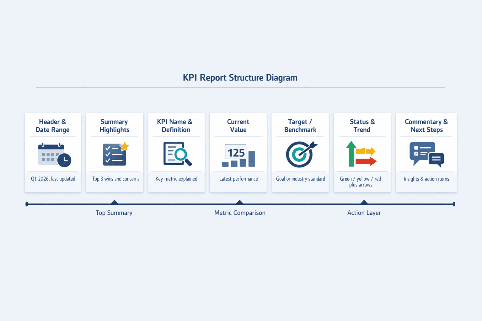
KPI reports vary by purpose, department, and industry, but the best ones share a common structure. They’re built to be scanned quickly and understood at a glance.
Here’s what most effective KPI reports include:
- Report header with date range — Shows the reporting period (weekly, monthly, quarterly) and when the report was last updated
- Summary or highlights section — Captures the three biggest wins and top concerns upfront
- KPI name and definition — Each metric is labeled clearly so there’s no confusion about what’s being measured
- Current value — The actual performance for this period
- Target or benchmark — The goal you’re measuring against (budget, prior period, industry standard)
- Status indicator — Color coding (green/yellow/red) or symbols (✓/⚠/✗) for at-a-glance assessment
- Trend direction — Arrows or sparklines showing whether performance is improving or declining
- Visual elements — Charts or graphs for metrics where trends matter more than absolute values
- Commentary or context — Brief notes explaining why a metric spiked, missed target, or needs attention
- Action items or next steps — What the team will do about problem areas
The examples below show how these components work in practice.
Sales KPI Report Example
A sales KPI report tracks revenue generation, pipeline health, and sales team performance. It answers: Are we hitting our number? Where’s the pipeline strong or weak? How efficient is the team?
Here’s a sample structure:
| KPI Name | Current Value | Target | Status | Trend |
|---|---|---|---|---|
| Monthly Revenue | $487K | $550K | 🟡 | ↗ |
| Conversion Rate | 18% | 20% | 🟡 | ↗ |
| Average Deal Size | $8,200 | $7,500 | 🟢 | ↗ |
| Sales Cycle Length | 42 days | 35 days | 🔴 | → |
| Win Rate | 28% | 30% | 🟡 | ↘ |
| Pipeline Value | $2.1M | $2.5M | 🟡 | ↗ |
| New Leads | 340 | 400 | 🔴 | ↘ |
| Customer Acquisition Cost | $1,850 | $1,600 | 🔴 | ↗ |
What makes this report effective:
- Balances leading and lagging indicators — Pipeline value and new leads predict future revenue; win rate and cycle length show current efficiency
- Revenue is front and center — The number one metric is always visible, with everything else supporting it
- Compares actual versus target — Status and trend columns show where the team is winning and where they’re falling short
- Highlights bottlenecks — Sales cycle length trending flat at 42 days signals a process problem, not just an effort problem
- Actionable at a glance — Red and yellow indicators tell the manager exactly which metrics need immediate attention
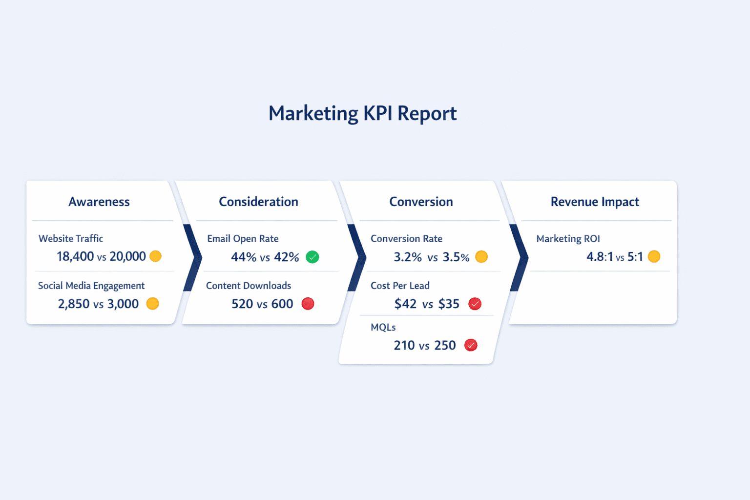
Marketing KPI Report Example
A marketing KPI report tracks campaign performance, lead generation, brand awareness, and return on investment. It shows whether marketing efforts are translating into pipeline and revenue.
Here’s a sample structure:
| KPI Name | Current Value | Target | Status | Trend |
|---|---|---|---|---|
| Website Traffic | 18,400 visits | 20,000 visits | 🟡 | ↗ |
| Conversion Rate | 3.2% | 3.5% | 🟡 | → |
| Cost Per Lead | $42 | $35 | 🔴 | ↗ |
| Email Open Rate | 44% | 42% | 🟢 | ↗ |
| Social Media Engagement | 2,850 interactions | 3,000 interactions | 🟡 | ↗ |
| Content Downloads | 520 | 600 | 🔴 | → |
| Marketing Qualified Leads | 210 | 250 | 🔴 | ↘ |
| Marketing ROI | 4.8:1 | 5:1 | 🟡 | ↗ |
What makes this report effective:
- Covers the full funnel — From awareness (traffic, engagement) to consideration (downloads, email opens) to conversion (MQLs, cost per lead)
- Tracks cost efficiency — Cost per lead and marketing ROI keep the team honest about spend effectiveness
- Balances engagement and outcomes — Email open rate is 44% (above the industry average of 42%), but the real question is whether opens translate to MQLs
- Demonstrates marketing contribution — Marketing ROI of 4.8:1 shows the team is generating $4.80 in pipeline for every dollar spent
- Highlights channel performance — If content downloads are flat while traffic is up, the content itself might need work
One note: email open rates are less reliable than they used to be thanks to Apple Mail Privacy Protection. The best marketing reports now emphasize click-through rate, conversions, and downstream revenue impact over opens alone.
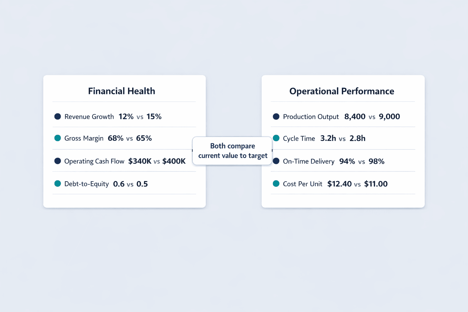
Financial KPI Report Example
A financial KPI report tracks company financial health, profitability, cash flow, and fiscal performance. It answers: Can we pay our bills? Are we profitable? Is the business sustainable?
Here’s a sample structure:
| KPI Name | Current Value | Target | Status | Trend |
|---|---|---|---|---|
| Revenue Growth Rate | 12% YoY | 15% YoY | 🟡 | → |
| Gross Profit Margin | 68% | 65% | 🟢 | ↗ |
| Net Profit Margin | 18% | 20% | 🟡 | ↗ |
| Operating Cash Flow | $340K | $400K | 🔴 | ↘ |
| Current Ratio | 2.1 | 2.0 | 🟢 | → |
| Debt-to-Equity Ratio | 0.6 | 0.5 | 🔴 | ↗ |
| EBITDA | $520K | $600K | 🟡 | ↗ |
| Burn Rate | $75K/month | $60K/month | 🔴 | → |
What makes this report effective:
- Snapshot of overall financial health — Current ratio of 2.1 means the company has more than enough assets to cover short-term liabilities
- Profitability and liquidity together — Gross and net margins show profitability, while operating cash flow and current ratio show whether the business can stay afloat
- Risk indicators visible — Debt-to-equity ratio trending up to 0.6 signals increasing leverage that may need attention
- Benchmarks against plan — Every metric compares against budget targets, making variances obvious
- Drives fiscal discipline — Burn rate stuck at $75K/month when the target is $60K tells leadership exactly where cost control is slipping
Operations KPI Report Example
An operations KPI report tracks efficiency, productivity, quality, and process performance. It shows whether the business is producing output on time, on budget, and at the right quality level.
Here’s a sample structure:
| KPI Name | Current Value | Target | Status | Trend |
|---|---|---|---|---|
| Production Output | 8,400 units | 9,000 units | 🟡 | → |
| Cycle Time | 3.2 hours | 2.8 hours | 🔴 | ↗ |
| Defect Rate | 2.1% | 1.5% | 🔴 | → |
| On-Time Delivery Rate | 94% | 98% | 🟡 | ↗ |
| Capacity Utilization | 82% | 85% | 🟡 | ↗ |
| Inventory Turnover | 6.5x | 7x | 🟡 | → |
| Order Fulfillment Time | 1.8 days | 1.5 days | 🔴 | → |
| Operational Cost Per Unit | $12.40 | $11.00 | 🔴 | ↘ |
What makes this report effective:
- Focuses on efficiency and quality — Cycle time, defect rate, and cost per unit all measure how well the operation runs
- Highlights bottlenecks — Cycle time stuck at 3.2 hours when the target is 2.8 points to a specific process slowdown
- Tracks productivity improvements — Capacity utilization trending up to 82% shows the team is getting more from existing resources
- Connects operations to customer satisfaction — On-time delivery rate of 94% is solid but not perfect—customers notice those 6% of late orders
- Cost control is visible — Operational cost per unit trending down to $12.40 (from a higher baseline) shows progress, but there’s still a $1.40 gap to target
Customer Service KPI Report Example
A customer service KPI report tracks support quality, response times, customer satisfaction, and service efficiency. It answers: Are we solving problems quickly? Are customers happy? Is the team overwhelmed?
Here’s a sample structure:
| KPI Name | Current Value | Target | Status | Trend |
|---|---|---|---|---|
| Customer Satisfaction Score | 4.3/5 | 4.5/5 | 🟡 | → |
| First Response Time | 4.2 hours | 2 hours | 🔴 | ↘ |
| Average Resolution Time | 18 hours | 12 hours | 🔴 | → |
| Ticket Volume | 1,240 | 1,000 | 🔴 | ↗ |
| First Contact Resolution Rate | 68% | 75% | 🔴 | ↘ |
| Net Promoter Score | 42 | 50 | 🔴 | → |
| Support Cost Per Ticket | $8.50 | $7.00 | 🔴 | ↗ |
| Customer Churn Rate | 3.2% | 2.5% | 🔴 | ↗ |
What makes this report effective:
- Balances speed and quality metrics — First response time and average resolution time measure speed, while CSAT and NPS measure quality
- Tracks customer sentiment — NPS of 42 and CSAT of 4.3/5 show customers are satisfied but not thrilled
- Monitors team workload — Ticket volume trending up to 1,240 when the target is 1,000 signals the team is stretched thin
- Links support to retention — Customer churn rate of 3.2% trending up correlates with declining first contact resolution and slower response times
- Cost efficiency is tracked — Support cost per ticket rising to $8.50 suggests either higher complexity issues or staffing inefficiencies
One important note: automated responses don’t count toward first response time. If your team is gaming the metric with autoreplies, this report won’t catch it—but your customers will notice.
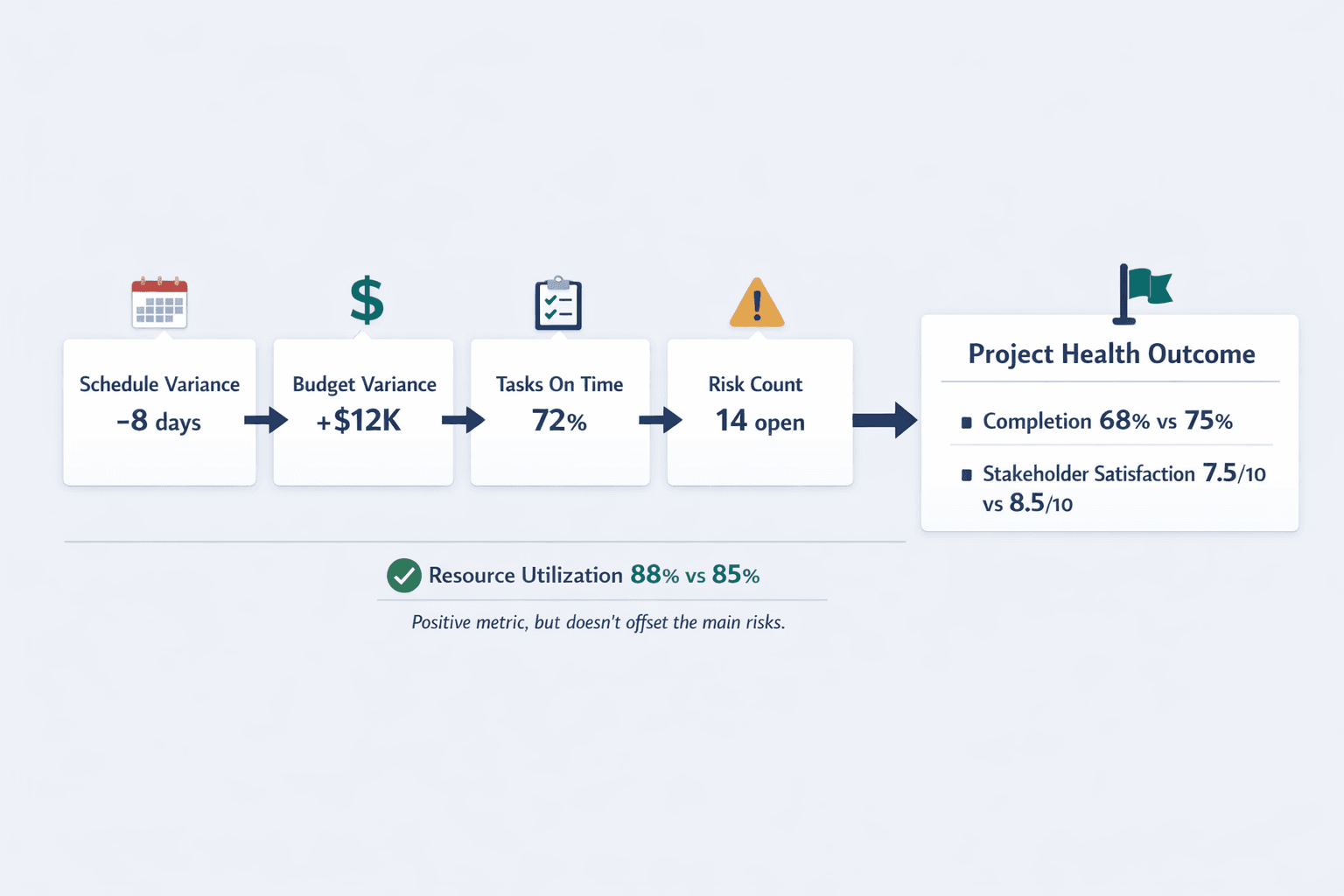
Project Management KPI Report Example
A project management KPI report tracks progress, timeline adherence, budget control, and resource utilization. It shows whether projects are on track and whether interventions are needed before deadlines slip.
Here’s a sample structure:
| KPI Name | Current Value | Target | Status | Trend |
|---|---|---|---|---|
| Project Completion % | 68% | 75% | 🔴 | → |
| Schedule Variance | -8 days | 0 days | 🔴 | ↘ |
| Budget Variance | +$12K over | $0 | 🔴 | ↗ |
| Tasks Completed On Time | 72% | 90% | 🔴 | → |
| Resource Utilization Rate | 88% | 85% | 🟢 | ↗ |
| Milestone Achievement Rate | 80% | 100% | 🔴 | → |
| Risk Count | 14 open | <10 open | 🔴 | ↗ |
| Stakeholder Satisfaction | 7.5/10 | 8.5/10 | 🟡 | → |
What makes this report effective:
- Clear progress visibility — Project completion percentage and milestone achievement rate show how much work is done versus planned
- Highlights risks early — Schedule variance of -8 days and budget variance of +$12K signal the project is slipping before it becomes a crisis
- Tracks both deliverables and process health — Tasks completed on time measures execution, while resource utilization shows whether the team is overworked or underutilized
- Enables proactive intervention — 14 open risks trending up tells the PM exactly where to focus mitigation efforts
- Stakeholder feedback is built in — Satisfaction score of 7.5/10 shows the project is on track operationally but stakeholders aren’t thrilled with the direction or communication
Executive Dashboard KPI Report Example
An executive dashboard contains high-level strategic metrics across all business functions for C-suite decision-making. It’s a single-page canvas that tells the story of the entire business at a glance.
Here’s a sample structure:
| Category | KPI Name | Current Value | Target | Status |
|---|---|---|---|---|
| Revenue | Total Revenue | $2.1M | $2.3M | 🟡 |
| Revenue | Revenue Growth Rate | 15% YoY | 18% YoY | 🟡 |
| Profitability | Gross Margin | 67% | 65% | 🟢 |
| Profitability | Net Margin | 19% | 22% | 🟡 |
| Customer | Customer Count | 3,840 | 4,000 | 🟡 |
| Customer | Retention Rate | 92% | 95% | 🔴 |
| Operations | On-Time Delivery | 95% | 98% | 🟡 |
| Operations | Capacity Utilization | 84% | 85% | 🟡 |
| People | Employee Satisfaction | 7.8/10 | 8.5/10 | 🔴 |
| People | Turnover Rate | 12% | 8% | 🔴 |
What makes this report effective:
- Cross-functional overview — Revenue, profitability, customer health, operations, and people are all visible in one place
- Strategic not tactical — No task-level detail—just the metrics that matter for board meetings and strategic planning
- Quick pattern recognition — Executives can see at a glance that revenue and profitability are solid but customer retention and employee satisfaction need attention
- Supports board-level discussions — When retention rate drops to 92% and turnover climbs to 12%, the executive team knows to investigate whether customer service or product quality is slipping
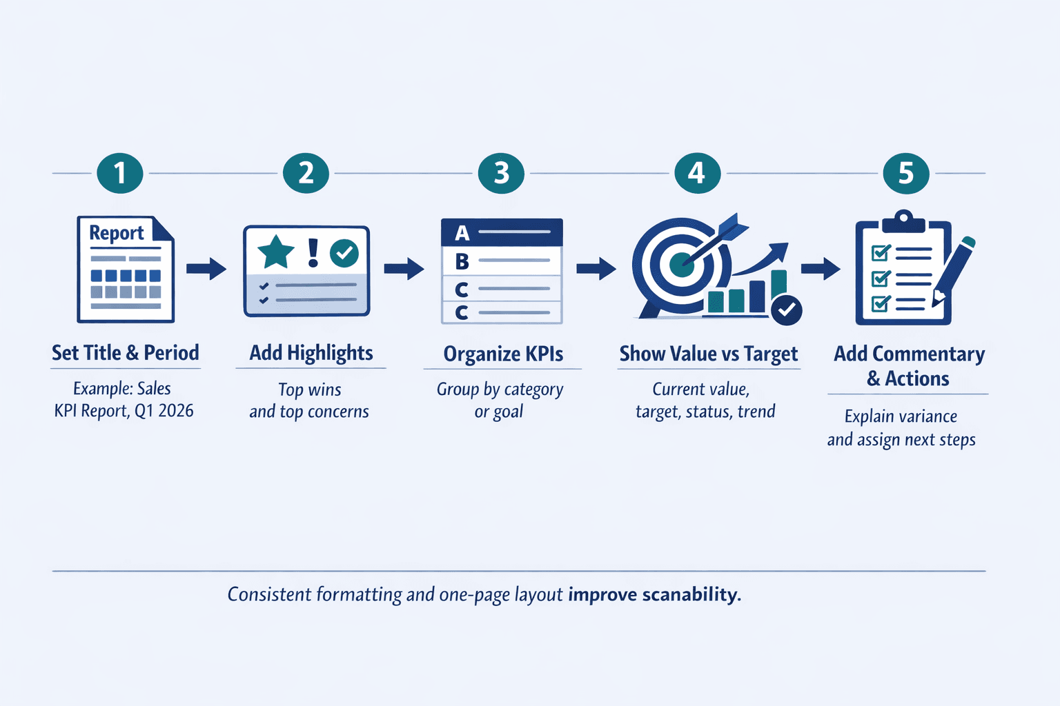
How to Structure Your KPI Report
Regardless of department, effective KPI reports follow certain structural best practices. Here’s what every report should include.
Essential Report Components
- Clear title and reporting period — “Sales KPI Report: Q1 2026” leaves no ambiguity about what you’re looking at
- Summary section with key highlights — A 2-3 sentence overview of the biggest wins and concerns saves busy executives from reading the entire report
- Organized sections by category or goal — Group related metrics together (e.g., all revenue metrics, all efficiency metrics)
- Consistent metric formatting — Every KPI should follow the same structure: name, current value, target, status, trend
- Visual elements for quick scanning — Charts, sparklines, and color coding help readers absorb information faster than tables alone
- Trend indicators showing direction — Arrows (↗↘→) or mini line charts show whether performance is improving, declining, or flat
- Contextual commentary explaining variance — A brief note like “CPL rose 15% due to holiday ad costs” adds meaning to raw numbers
- Color coding for status at-a-glance — Green/yellow/red or ✓/⚠/✗ lets readers prioritize which metrics need attention
- Targets or benchmarks for comparison — Without a goal or standard, a metric is just a number—context makes it actionable
- Action items or recommendations — End with 2-3 specific next steps so the report drives decisions, not just discussion
Design Principles for KPI Reports
- One page when possible — Reports should tell a story on one screen for quick consumption; detail lives in drill-down views
- Visual hierarchy prioritizing important metrics — Put the highest-level data at the top left; readers scan in an F-pattern
- Consistent formatting across reporting periods — Use the same chart scales, color schemes, time frames, and rounding so comparisons are easy
- Appropriate chart types for each metric — Bar charts for comparisons, line charts for trends, gauges for progress toward a goal
- Minimal text focusing on insights — Describe what the data means, not what it is—“Pipeline grew 15% but conversion dropped 3 points” beats “Pipeline value is $2.1M”
- Stakeholder-specific views for different audiences — Executives need strategic summaries; front-line teams need granular detail
Common KPI Report Formats
KPI reports can be delivered in various formats depending on audience, frequency, and tooling. The format you choose should match how often the report updates, how technical your audience is, and whether they need to interact with the data.
Common formats include:
- Spreadsheet-based reports — Excel or Google Sheets with tables and embedded charts; easy to customize but manual to update
- Slide deck presentations — PowerPoint or Google Slides for meetings; good for storytelling but not real-time
- Automated dashboard tools — Tableau, Power BI, Looker; best for real-time data and complex visualizations
- One-page PDF summaries — Static reports emailed weekly or monthly; easy to distribute but no interactivity
- Email digests with key metrics — Automated emails with top KPIs embedded; great for daily or weekly cadence
- Real-time web dashboards — Dashboards accessible via browser with live data feeds; best for operational teams
- Printed wall displays — Large-format KPI boards posted in the office for team visibility
- Mobile app views — Optimized for smartphones for on-the-go access; include only the most critical metrics
Format choice depends on update frequency, audience technical skills, and interactivity needs. A CFO might prefer a weekly PDF summary, while a sales team might need a real-time dashboard they can check hourly.
KPI Report Best Practices
Creating effective KPI reports requires more than just picking metrics and plugging in numbers. Here’s how to ensure your reports drive action instead of gathering dust.
Selecting the Right KPIs
- Aligned with strategic business goals — If the company’s goal is growth, track revenue, customer acquisition, and retention—not vanity metrics like social media followers
- Actionable with clear owners — Every KPI should have someone responsible for improving it; if nobody owns it, don’t track it
- Measurable with reliable data — If your data source is incomplete, inconsistent, or outdated, the KPI won’t drive decisions
- Relevant to the report audience — Front-line teams need tactical metrics; executives need strategic ones
- Limited in number to avoid overwhelm — Track 5-10 KPIs per report; more than that and readers won’t know what to focus on
- Mix of leading and lagging indicators — Leading indicators predict future performance (pipeline value, new leads); lagging indicators show results (revenue, churn)
Reporting Frequency Guidelines
- Strategic KPIs reviewed monthly or quarterly — High-level business health metrics don’t change fast enough to justify weekly reviews
- Operational KPIs tracked weekly or daily — Metrics like support ticket volume, production output, and daily revenue need frequent monitoring
- Frequency matches decision-making cycle — If leadership meets monthly to review performance, monthly reports make sense
- More frequent reporting for volatile metrics — Customer service response time can spike in hours; quarterly reviews would miss the problem
- Balance between timeliness and analysis overhead — Daily reports take time to produce—make sure the value justifies the effort
Making Reports Actionable
- Include trend analysis, not just current values — Showing revenue at $2.1M is informative; showing it’s up 8% from last month is actionable
- Provide context for variance from targets — Explain why a metric missed or exceeded expectations
- Highlight areas requiring attention — Use status indicators and commentary to point readers toward problems
- Suggest specific next steps — “CPL rose 15% due to holiday ad costs—pause Meta ads until Jan 15” is better than just flagging the metric
- Assign ownership for follow-up items — If the report says “improve conversion rate,” name who’s responsible
- Link metrics to business outcomes — Show how improving first response time from 4 hours to 2 hours could reduce churn by 1.5%
FAQ
What Is a KPI Report Example?
A KPI report example is a sample document showing how organizations track and present key performance indicators. It typically includes metric names, current values, targets, status indicators (green/yellow/red), trend arrows, and sometimes visual elements like charts or sparklines.
Examples help teams understand what metrics to track for their function, how to structure the report for clarity, and what presentation style works best. A sales KPI report example might show revenue, conversion rate, and pipeline value arranged in a table with status and trend columns—giving teams a template they can adapt.
What Is an Example of a KPI Report?
A concrete example: A sales KPI report tracks monthly revenue of $487K against a $550K target (88% to goal, yellow status), with a conversion rate of 18% trending up from 15% last quarter (green status, upward arrow). The report displays these metrics in a one-page dashboard with bar charts showing revenue progression over time and a pipeline funnel showing opportunity stages.
Effective examples are specific to industry and department rather than generic. A healthcare clinic’s KPI report looks different from a SaaS company’s, even if both track revenue and customer satisfaction.
Sample of KPI Report
A sample KPI report typically includes 5-10 key metrics organized by category, with each metric showing current performance, target, percentage to goal, and trend direction using arrows or color coding. For example, a marketing KPI report might track website traffic (18,400 visits vs. 20,000 target), cost per lead ($42 vs. $35 target), and marketing qualified leads (210 vs. 250 target), with yellow status indicators showing areas that need attention.
Samples often include a summary section highlighting top achievements and concerns—something like “Website traffic up 12% but CPL rose 20% due to increased ad spend”—followed by detailed metric breakdowns with supporting charts showing performance over the past three months. The goal is to enable quick assessment at a glance while providing enough context for decision-making.