KPI Report Template (Free Download)
A KPI report template is a pre-formatted document that standardizes how teams track metrics against targets. This guide covers Excel, Google Sheets, and Word formats—plus where to download free templates you can customize today.
Quick Verdict
A KPI report template is a pre-formatted document structure that helps businesses track key performance indicators against targets over time. Companies use them to standardize how teams measure progress, compare results across periods, and communicate performance to stakeholders without rebuilding reports from scratch every week or month.
Most templates include dedicated sections for metric names, current values, target goals, variance calculations, time period labels, and visual elements like charts or status indicators. They’re designed to make reporting consistent across departments and reduce the time spent formatting spreadsheets or documents.
This guide covers the three main KPI report template formats—Excel, Google Sheets, and Word—how to choose the right one for your needs, and where to download free templates you can customize for your team today.
What Is a KPI Report Template?
A KPI report template is a reusable document structure designed specifically for tracking key performance indicators. Instead of building a new report each time you measure performance, you start with a pre-built format that already includes the right fields, formulas, and layout.
The benefit is speed and consistency. Templates eliminate the “blank page” problem and ensure everyone on your team reports metrics the same way. That makes comparing performance across months, quarters, or departments significantly easier.
Most KPI report templates include:
- Metric identification fields — KPI name, description, owner
- Date range selectors — weekly, monthly, quarterly, annual periods
- Target vs actual columns — goal value and current performance side by side
- Variance calculations — difference between target and actual, often as percentage
- Visual status indicators — traffic lights, progress bars, trend arrows
- Notes or commentary sections — space for context, explanations, action items
Templates standardize how your organization defines success and tracks it. When everyone uses the same structure, stakeholders can quickly scan a report and understand whether metrics are on track—without needing to decode a new layout every time.
KPI Report Template Excel
Excel is the most widely used format for KPI report templates. It’s the default choice for most businesses because it combines data handling, calculation power, and visualization tools in one place.
Here’s why Excel dominates KPI reporting:
- Built-in formulas — calculate variance, percentage to goal, and trends automatically
- Chart creation — build bar charts, line graphs, and gauges directly from your data
- Widespread availability — most teams already have Excel licenses
- Offline access — work on reports without internet connectivity
- Customization flexibility — adjust layouts, colors, and formulas to fit your needs exactly
- Data import capabilities — pull in data from databases, CSV files, or other sources
- PivotTable support — drill down into metrics by time period, department, or product line
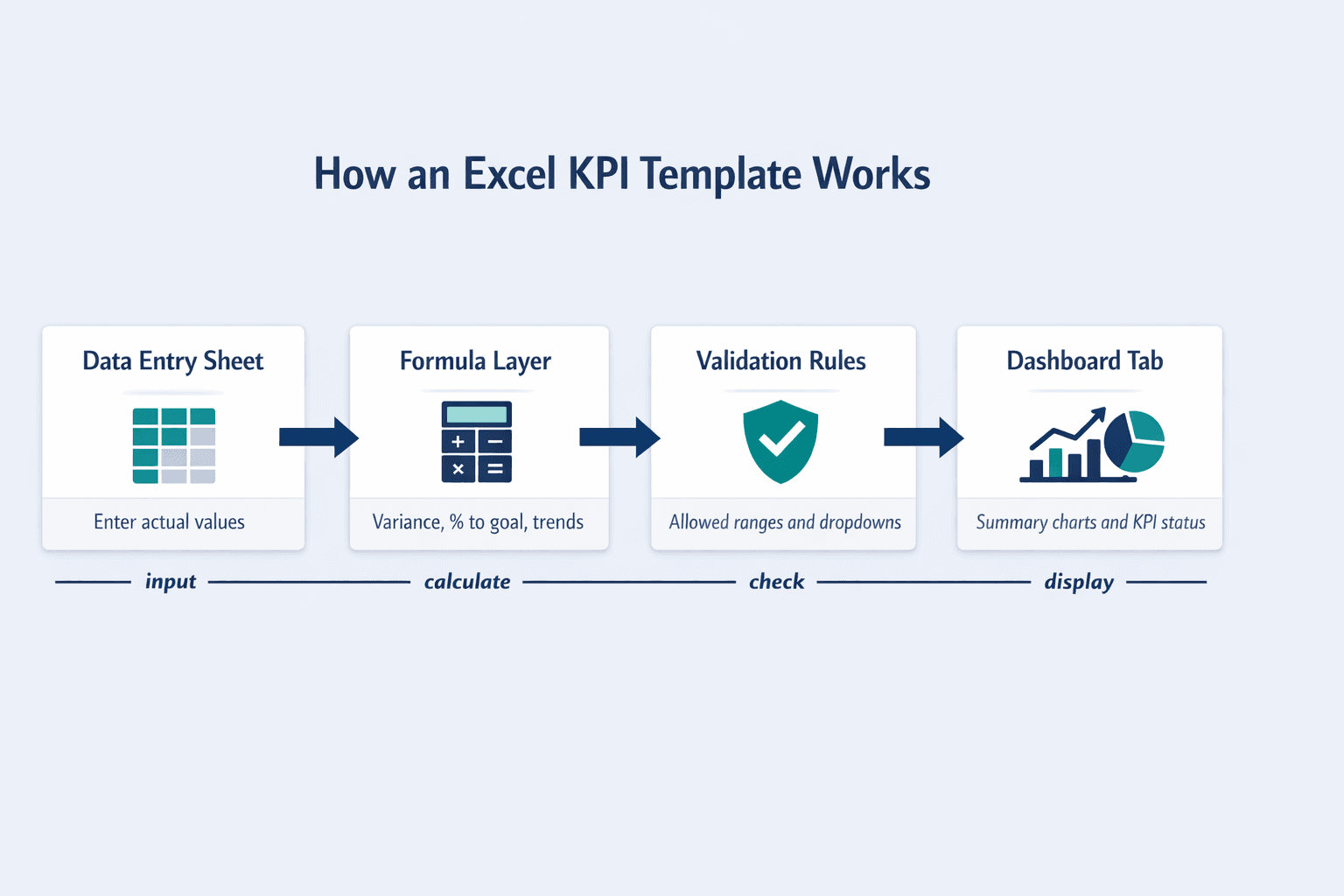
A typical Excel KPI report template has multiple worksheets: a dashboard tab that displays summary visuals and key metrics, data entry sheets where you input raw values, and hidden calculation sheets that handle formulas automatically. When you update the data entry cells, the dashboard refreshes instantly.
Key Features of Excel KPI Templates
Excel templates use specific features that make KPI tracking more efficient:
- Conditional formatting — automatically highlights cells red when metrics miss targets, green when they exceed goals
- Formula-driven calculations — variance, percentage complete, and year-over-year growth update automatically when you enter new data
- Drop-down menus — use data validation to create selectors for time periods, departments, or metric categories
- Linked charts — charts pull data from designated cells and refresh when values change
- Multiple worksheet organization — separate tabs for input, calculations, and presentation keep the template clean
- Data validation rules — restrict entries to valid ranges (e.g., percentages between 0-100) to prevent errors
KPI Report Template Google Sheets
Google Sheets is the cloud-based alternative for KPI reporting. It works best when multiple people need to update or view the same report simultaneously.
The main advantages of Google Sheets for KPI templates:
- Real-time collaboration — multiple users can edit the same spreadsheet at once
- Automatic saving — no risk of losing work if your computer crashes
- Access from any device — view or edit KPI reports from your phone, tablet, or any web browser
- Easy sharing via link — send a URL instead of emailing file attachments back and forth
- Free to use — no license required beyond a Google account
- Integration with other Google tools — connect to Forms, Data Studio, or Apps Script for automation
- Simultaneous editing — see changes from teammates in real time as they type
Google Sheets versus Excel: use Sheets when your team needs to collaborate on KPI updates throughout the month. Use Excel when you need more advanced formulas, larger datasets, or offline access. For most small to mid-sized teams tracking 5-15 KPIs, Sheets handles everything you need.
Collaboration Features in Google Sheets Templates
Google Sheets is built for teamwork. Here’s what makes it better than Excel for collaborative KPI reporting:
- Commenting on specific cells — tag teammates with @mentions to ask questions about specific metrics
- Revision history tracking — view and restore previous versions if someone accidentally overwrites data
- Permission controls — set different access levels (view-only, comment, edit) for different users
- Notification settings — get email alerts when someone updates key cells
- Sharing options — share with specific people, anyone in your organization, or make it public (useful for investor dashboards)
KPI Report Template Word
Word format is used for KPI reports when you need a narrative document rather than a live data workbook. It’s the format for executive summaries, board presentations, and formal documentation where the focus is on explaining performance, not manipulating numbers.
When Word KPI templates make sense:
- Executive summary reports — one-page overviews with a few key metrics and written context
- Narrative-focused reporting — reports that emphasize explanation and recommendations more than raw data
- Presentation attachments — printed handouts or PDF exports for meetings
- Simple non-data-intensive reports — tracking 3-5 high-level KPIs with minimal calculations
- Formal documentation requirements — situations where a polished, printable document is expected
- Situations requiring extensive written analysis — when the story matters more than the spreadsheet
A typical Word KPI template has a title section, a summary table with 5-10 key metrics, individual sections for each KPI with explanatory text, and a recommendations area at the end. Charts can be embedded directly in the document or linked to an Excel file for easier updating.
Limitations of Word Templates
Word is the least common format for KPI reporting because it’s not built for data handling. Here’s why it’s usually the wrong choice:
No automated calculations. If your goal increases from $100K to $120K, you have to manually recalculate variance in every cell. There’s no formula support like Excel or Sheets.
Charts require manual updates or Excel integration. You can’t just type new numbers and watch visuals refresh. You either embed a static image (which never updates) or link to an external Excel file (which defeats the purpose of using Word).
Word also struggles with large datasets. If you’re tracking 20+ KPIs with monthly data for the past year, Word becomes unwieldy fast. Spreadsheets are simply better suited for that structure.
Use Word only when the deliverable is primarily a written report with a few supporting metrics—not when you need ongoing data tracking.
How to Choose the Right KPI Report Template Format
The right format depends on who needs access, how often you’ll update the report, and whether you need live calculations or just a polished summary.
Here’s a direct comparison:
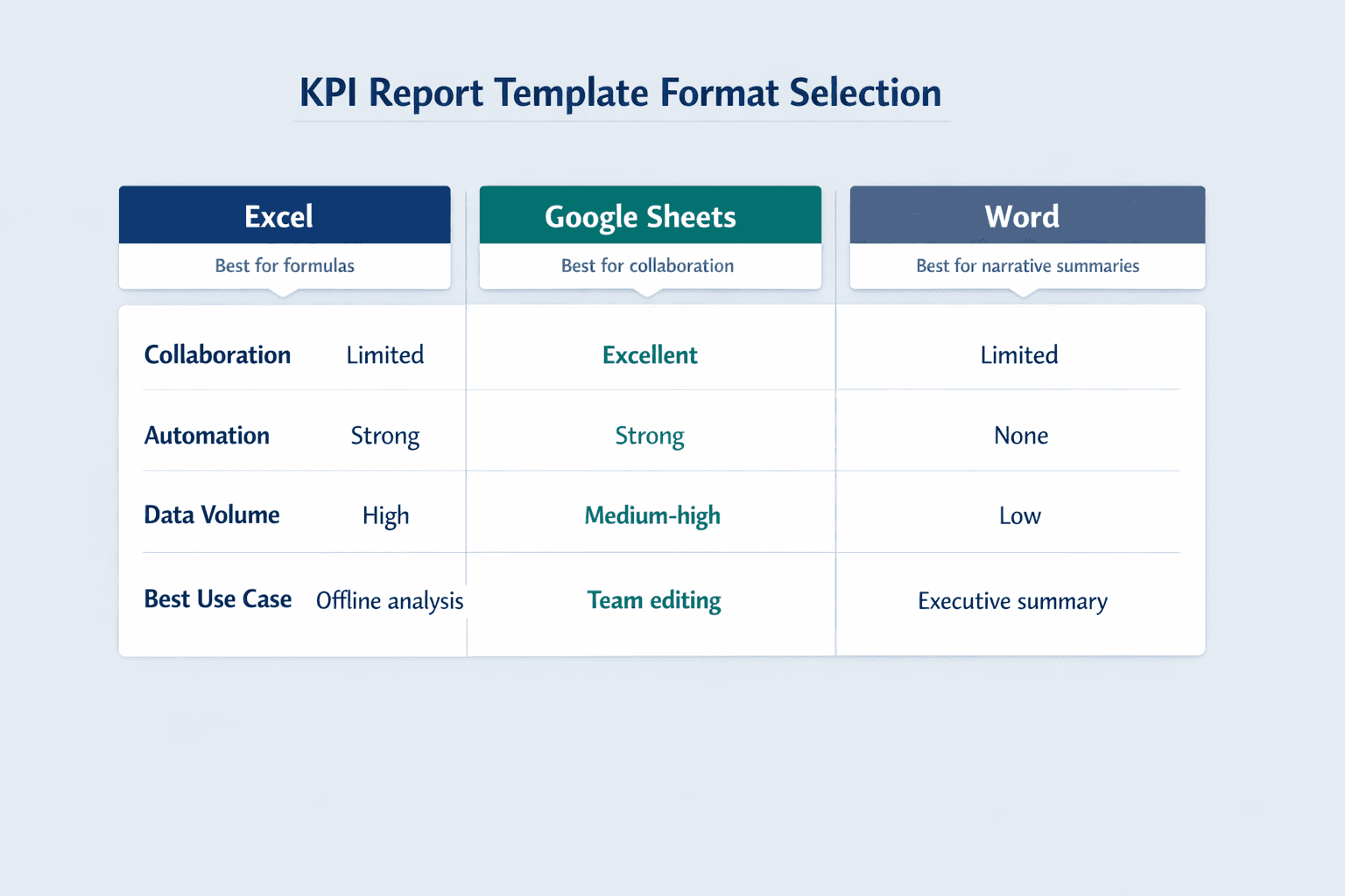
| Format | Best For | Collaboration | Automation | Data Volume | Access | Cost |
|---|---|---|---|---|---|---|
| Excel | Teams with existing Office licenses, heavy formula use, offline work | Limited (file sharing) | Strong (formulas, PivotTables) | High | Desktop + cloud | Paid (included in Office) |
| Google Sheets | Remote teams, real-time collaboration, multi-user editing | Excellent (simultaneous editing) | Strong (formulas, integrations) | Medium-high | Cloud only | Free |
| Word | Executive summaries, formal reports, minimal data manipulation | Limited (comments only) | None | Low | Desktop + cloud | Paid (included in Office) |
Use Excel if you need PivotTables, slicers, advanced formulas, or you’re already paying for Office 365.
Use Google Sheets if your team is distributed, you need real-time collaboration, or you want free cloud access.
Use Word if you’re writing a narrative report for executives or board members where the focus is explanation, not numbers.
Questions to Ask Before Selecting a Format
Before you download a template, answer these questions:
- How many people need access? If it’s just you, Excel works fine. If it’s a team of 5+ editing simultaneously, use Google Sheets.
- Do you need real-time collaboration? Sheets is designed for this. Excel requires SharePoint or OneDrive, which is clunkier.
- How much data will you track? Tracking 50 KPIs with 3 years of history? Excel or Sheets. Tracking 5 KPIs with light context? Word might work.
- Do you need automated calculations? If yes, eliminate Word immediately. Spreadsheets only.
- Will reports include mostly numbers or narrative? Numbers = spreadsheet. Story = Word.
- What tools does your team already use? Don’t force Excel on a Google Workspace team or Sheets on an Office-first company. Go with what people already know.
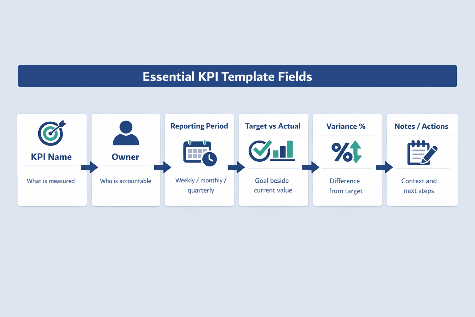
Essential Elements to Include in Your KPI Report Template
Every KPI report template needs the same core components, whether you’re using Excel, Sheets, or Word. These fields give context, track progress, and make reports actionable.
Required Data Fields
At minimum, your template must include:
- Reporting period — week ending date, month, quarter, or year
- KPI name/description — clear label for what you’re measuring
- Target/goal value — what success looks like for this metric
- Actual value — current performance
- Variance/difference — target minus actual (or actual minus target, depending on metric direction)
- Percentage to goal — how close you are to hitting the target (e.g., 87%)
- Trend indicator — up arrow, down arrow, or flat to show direction
- Owner/responsible party — who’s accountable for moving this metric
These fields let you answer three critical questions at a glance: Are we winning? By how much? Who’s responsible?
Visual Elements
Numbers alone don’t tell the story. Add these visual components to make KPI reports scannable:
- Trend charts — line graphs showing performance over the last 6-12 periods
- Gauge charts for goal progress — visual “speedometer” showing percentage complete
- Traffic light status indicators — conditional formatting that turns cells red (behind target), yellow (close), or green (ahead)
- Comparison tables — current period versus prior period or year-over-year
- Sparklines for quick trends — tiny inline charts that show direction without taking up much space
Contextual Information
Raw metrics need explanation. Include these context fields so readers understand the “why” behind the numbers:
- Data source — where the numbers come from (Salesforce, Google Analytics, manual entry, etc.)
- Last updated date — when the report was refreshed
- Notes/commentary section — space to explain anomalies, wins, or blockers
- Action items — what needs to happen to improve underperforming metrics
- Previous period comparison — month-over-month or quarter-over-quarter change
Where to Download Free KPI Report Templates
You don’t need to build a KPI template from scratch. Multiple sources offer free, customizable templates in Excel, Google Sheets, and Word formats.
Excel KPI Templates
- Microsoft Create template gallery — free Excel-based tracker templates you can adapt for KPI reporting
- Smartsheet KPI dashboard templates — downloadable Excel files for simple KPI, performance KPI, project KPI, and efficiency dashboards
- Microsoft Office template collection — built-in templates in Excel for the web
- Business tool provider libraries — many SaaS companies offer free templates as lead magnets
- This article’s download link — we provide a ready-to-use Excel KPI template you can customize immediately
Google Sheets KPI Templates
- Google Sheets template gallery — pre-built templates accessible from File > New > From template gallery in Sheets
- Smartsheet Google Sheets templates — free KPI dashboard templates in Sheets format alongside their Excel versions
- Google Workspace Marketplace — add-ons that include KPI dashboard templates and other business templates
- Copyable public templates — search “KPI template” in Google Sheets to find shared templates you can copy
- This article’s download link — we offer a Google Sheets version of our KPI template
Word KPI Templates
- Microsoft Office template collection — search for “report” or “business summary” templates
- Smartsheet business report templates — includes KPI-oriented report formats for formal documentation
- Consulting firm free resources — many consulting companies offer Word-based frameworks as downloads
- This article’s download link — our Word KPI template is designed for executive summaries
How to Customize Your KPI Report Template
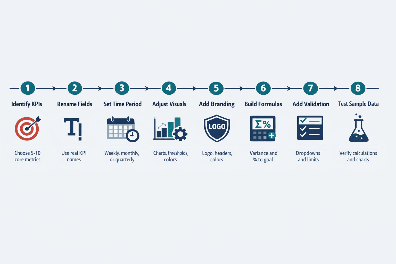
A template is a starting point, not a final product. Here’s how to adapt it to your specific business needs:
- Identify your specific KPIs (15 minutes): List the 5-10 metrics that actually matter to your team. Don’t track everything—focus on metrics tied to goals.
- Adjust metric fields to match your needs (10 minutes): Replace generic “Revenue” labels with your actual KPIs like “Monthly Recurring Revenue” or “Customer Acquisition Cost.”
- Modify time period structure (5 minutes): Change the template from monthly to weekly or quarterly depending on how often you review performance.
- Customize visual elements (20 minutes): Adjust chart types, colors, and threshold values to match your brand and performance ranges.
- Add your branding (10 minutes): Insert your company logo, adjust colors to match brand guidelines, update headers and footers.
- Set up formulas for your calculations (15 minutes): Update variance formulas, percentage calculations, and conditional formatting rules to match your metric definitions.
- Create data validation rules (10 minutes): Add drop-down menus for department selection, date pickers for period selection, or restricted ranges for percentage fields.
- Test with sample data (10 minutes): Enter fake numbers to make sure formulas calculate correctly and charts display as expected.
Customization Tips by Format
For Word: If you need charts that update, link them to an Excel file rather than embedding static images. Use tables with clear borders for metric summaries—they’re easier to scan than paragraphs. Apply heading styles consistently so the document outline is navigable. Add page breaks before each major section so the report prints cleanly.
Common Mistakes to Avoid When Using KPI Report Templates
Even with a good template, teams make predictable mistakes that reduce effectiveness. Here’s what to watch out for:
- Tracking too many KPIs — more than 10 metrics makes it hard to focus; pick the ones that actually drive decisions
- Choosing metrics that don’t align with goals — don’t track “website visits” if your real goal is “qualified leads”; measure what matters
- Failing to update regularly — a KPI report that’s 3 months out of date is useless; set a recurring calendar reminder
- Not customizing templates to specific needs — generic templates are starting points; adapt them to your business context
- Overcomplicating the format — simpler is better; if stakeholders can’t understand the report in 30 seconds, it’s too complex
- Neglecting data accuracy — double-check formulas and data sources; one wrong number destroys credibility
- Inconsistent reporting periods — switching between weekly and monthly mid-year makes trend analysis impossible
- Lack of context or explanation — numbers without narrative don’t drive action; always add a notes section
FAQ
What should be included in a KPI report?
Every KPI report should include the metric name, current value, target value, time period, and variance between actual and goal. Add trend direction (up/down arrows) and contextual notes explaining why the metric moved. Without target values and context, you just have numbers—not performance insights.
How often should KPI reports be updated?
Update frequency depends on the metric type. Operational metrics like daily sales or website uptime should update daily. Team-level metrics like project completion rates work best weekly. Strategic KPIs like revenue, customer retention, or market share are typically reviewed monthly or quarterly. The key is consistency—pick a cadence and stick to it so trends are meaningful.
Can I use the same KPI template for different departments?
Yes, but customize the metrics. The structure—target vs actual columns, variance calculations, trend charts—stays the same. But sales should track revenue and conversion rates while customer success tracks retention and NPS. Use the same template format so leadership can compare performance across departments, but swap in department-specific KPIs.
What's the difference between a KPI report and a KPI dashboard?
A KPI report is a periodic snapshot—usually a document or spreadsheet you create weekly or monthly. A KPI dashboard is a real-time visual display that updates continuously as new data comes in. Reports are for scheduled reviews; dashboards are for live monitoring. Most teams use both: dashboards for day-to-day tracking, reports for formal reviews with stakeholders.
How many KPIs should I track in one report?
Aim for 5-10 KPIs per report. More than that dilutes focus and makes it harder to identify what actually needs attention. If you’re tracking 20+ metrics, you’re probably measuring activity instead of outcomes. Ask: if we could only track 5 numbers, which ones would tell us whether we’re winning? Those are your KPIs.