What Is a KPI Report? Complete Guide
A KPI report tracks key performance indicators—the metrics that show if you're hitting business goals. This guide covers what they contain, how they're structured, and how to read them effectively.
Quick Verdict
A KPI report is a structured document that tracks key performance indicators—the quantifiable metrics that show whether a business is hitting its most important goals. It’s how organizations translate raw data into actionable insights about performance, progress, and problems.
KPI reports matter because data-driven organizations are 63% more likely to adapt successfully to changing business conditions. Instead of guessing what’s working, teams use KPI reports to measure results, spot trends early, and make informed decisions. They turn vague questions like “Are we doing well?” into specific answers backed by numbers.
This guide covers everything you need to understand KPI reports—what they are, what they contain, how they’re formatted, and how to read them effectively. Whether you’re creating your first report or trying to make sense of one someone sent you, you’ll learn the fundamentals.
What Is a KPI Report?
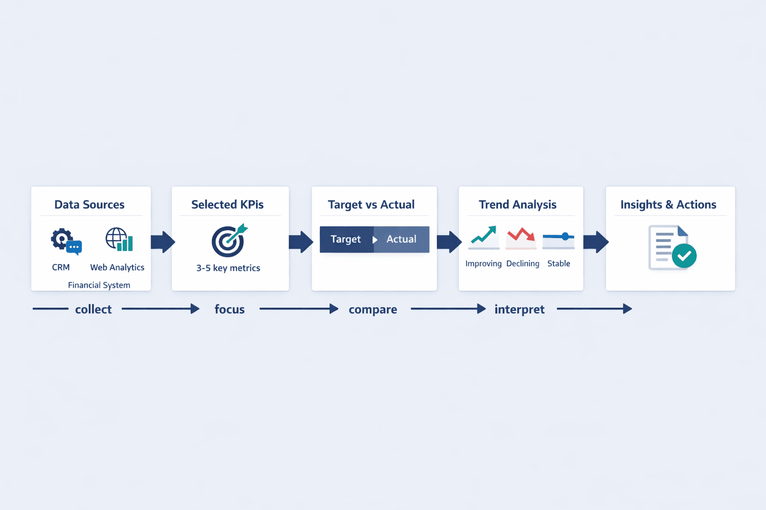
A KPI report is a document that tracks selected key performance indicators over a specific time period. It shows how a business, team, or project is performing against defined goals by measuring what matters most.
KPI reports combine metrics, data visualizations, and performance analysis to help both technical and non-technical audiences understand progress. They turn complex datasets into clear answers about whether you’re hitting targets, falling behind, or outperforming expectations. The best reports don’t just show numbers—they highlight trends, identify problems, and point toward necessary actions.
A complete KPI report typically includes:
- Core metrics — The 3-5 KPIs that directly measure progress toward business objectives
- Time period — The reporting window (daily, weekly, monthly, quarterly, annual)
- Data sources — Where the numbers come from (CRM, analytics platform, financial system)
- Target vs. actual — What you aimed for compared to what actually happened
- Performance trends — How metrics are changing over time (improving, declining, stable)
- Visual elements — Charts, graphs, gauges, and scorecards for quick comprehension
- Context and insights — Brief explanations of what the numbers mean and why they matter
KPI reports differ from general analytics reports because they’re focused and goal-oriented. An analytics report might show every possible metric from your website—pageviews, bounce rate, time on site, conversion by channel, device breakdowns. A KPI report picks only the 3-5 metrics that directly measure whether you’re achieving your quarterly revenue goal.
KPI Report Definition
A KPI report is a business document that measures and communicates performance against key strategic objectives. It’s a structured way to answer “Are we succeeding?” with quantifiable evidence.
Breaking down the term: “KPI” stands for key performance indicator—a quantifiable metric used to measure progress toward important business objectives over time. “Report” means a structured document that organizes information for analysis and decision-making. Put them together and you get a focused performance snapshot that tells you whether you’re on track, ahead, or falling behind.
What makes a report a KPI report:
- Measurability — Every metric has a number you can track consistently over time
- Relevance to goals — Each KPI directly connects to a strategic business objective
- Time-bound tracking — Performance is measured within defined periods for comparison
- Actionable insights — The report shows not just what happened, but suggests what to do next
- Accessibility to stakeholders — Information is presented clearly for the people responsible for outcomes
KPI reports track different metrics depending on what matters to your business. A SaaS company might track monthly recurring revenue, customer churn rate, and customer acquisition cost. A manufacturing operation might measure overall equipment effectiveness, first-pass yield, and on-time delivery rate. A marketing team might focus on conversion rate, cost per lead, and return on ad spend.
KPI Report Meaning
KPI reports translate business performance into clear, measurable terms. They’re the bridge between strategy and execution—showing whether your daily work is moving you toward your goals.
The purpose of KPI reporting is to help organizations measure performance, uncover insights, take action, and improve results. Instead of waiting until the end of a quarter to discover you missed your target, KPI reports give early warning signals so you can course-correct. They create accountability by making performance visible and comparable over time.
KPI reports serve multiple purposes:
- Progress tracking — Show how far you’ve come toward goals and how much remains
- Accountability — Make performance visible so teams and individuals own their outcomes
- Identifying trends — Reveal patterns you’d miss looking at individual data points
- Informing strategy — Provide evidence for deciding what to do next
- Communicating performance — Give executives, managers, and teams a common view of results
- Early problem detection — Flag issues before they become crises
Different stakeholders use KPI reports differently. Executives review high-level strategic reports monthly or quarterly to make major decisions. Department managers track operational KPIs weekly to keep their teams on course. Individual contributors might check daily metrics to optimize their work. The frequency and detail level depend on the audience and how quickly they need to respond to changes.
What KPI Reports Reveal About Business Performance
KPI reports translate raw data into meaningful business intelligence. They answer the questions that matter: What’s working? What’s not? Where should we focus?
Strong KPI reports reveal:
- Performance gaps — The distance between where you are and where you need to be
- Trend patterns — Whether performance is improving, declining, or holding steady
- Achievement levels — How you compare to past performance and industry benchmarks
- Problem areas — Metrics falling behind that need immediate attention
- Success drivers — What’s causing improvements so you can do more of it
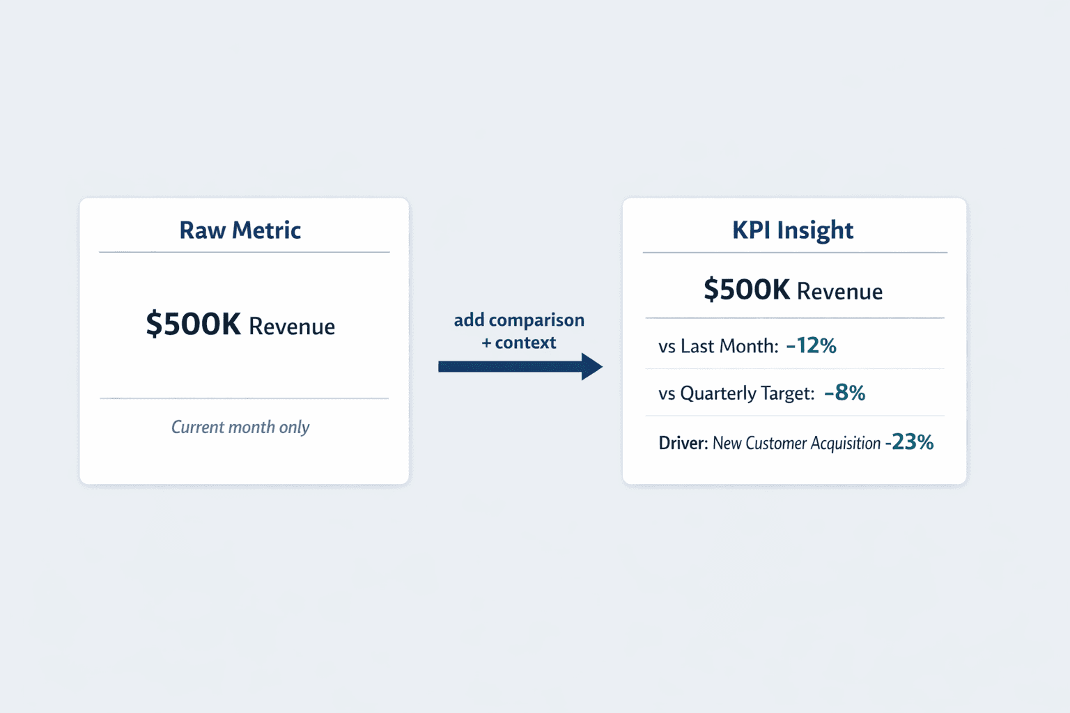
The best reports don’t just display numbers—they compare current performance to past activities using fresh data, helping you spot emerging trends and make better-informed decisions. They provide the business context that turns a metric from “revenue is $500K this month” into “revenue is down 12% from last month and 8% below our quarterly target, driven primarily by a 23% drop in new customer acquisition.”
KPI Report Format
KPI reports follow common structural principles, though the specific format varies by industry, audience, and reporting tool. Most reports balance detailed data with visual clarity—enough information to understand performance without overwhelming the reader.
The format depends on who’s reading it and why. An executive dashboard might show just 5-6 high-level KPIs with simple visualizations. A department manager’s report might include 15-20 metrics with trend lines and comparisons. A data analyst’s deep-dive might contain dozens of supporting metrics with granular breakdowns.
Essential Elements of KPI Report Format
Standard KPI reports include these core components:
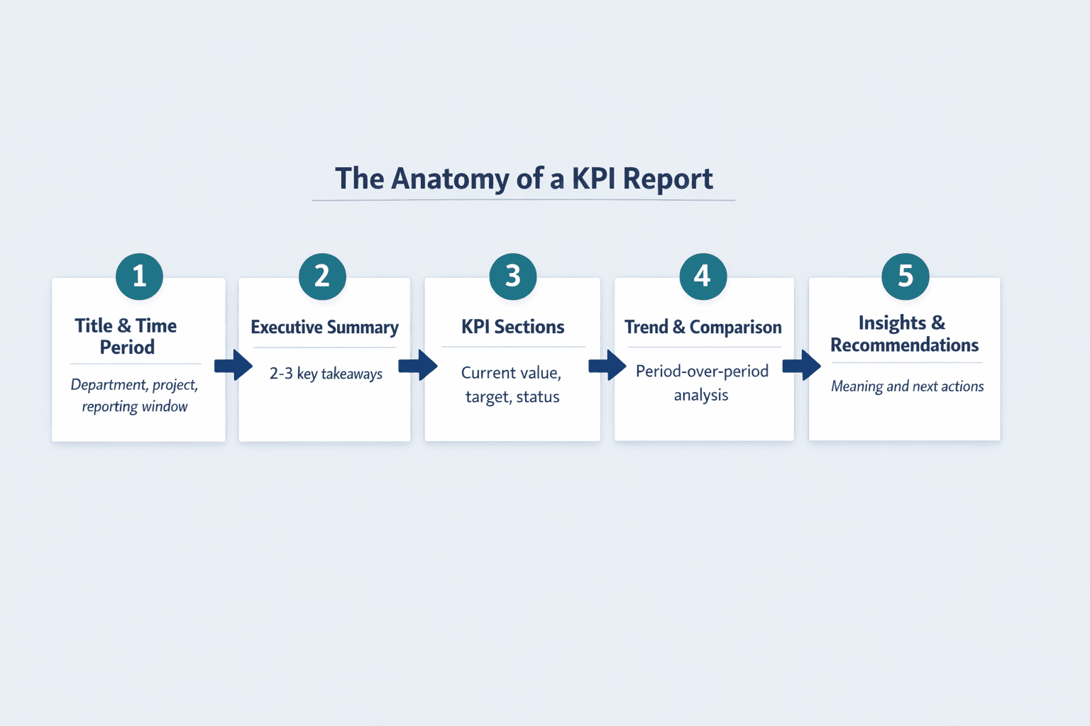
- Report title and context — What’s being measured, for which department or project
- Time period covered — The reporting window (e.g., “Q1 2026” or “Week of March 10-16”)
- Executive summary — 2-3 sentence overview of overall performance and key takeaways
- Individual KPI sections — One block per metric with current value, target, and status
- Data visualizations — Charts, graphs, gauges, or scorecards showing performance at a glance
- Period-over-period comparisons — How current performance stacks up against previous periods
- Trend analysis — Whether metrics are improving, declining, or stable over time
- Insights and recommendations — Brief explanations of what happened and what to do next
- Data source transparency — Where the numbers came from to establish credibility
Common KPI Report Layouts
| Format Type | Best Use Case | Typical Structure | Visual Emphasis |
|---|---|---|---|
| Scorecard | Executive overview, at-a-glance status | Single-page grid of KPIs with color-coded status indicators | High-level, minimal detail |
| Dashboard | Real-time monitoring, operational tracking | Interactive visualizations with filters and drill-downs | Charts and graphs, dynamic |
| Narrative Report | Detailed analysis, strategic review | Multi-page document with context, analysis, and recommendations | Text-heavy with supporting visuals |
| Department Report | Team-specific performance tracking | Organized by functional area with relevant metrics for each team | Balanced text and visuals |
Scorecards combine multiple reports and data onto a single page for quick status checks. Dashboards provide a high-level view designed to answer a central question with interactive elements. Reports tend to offer deeper analysis of specific datasets with more context and explanation.
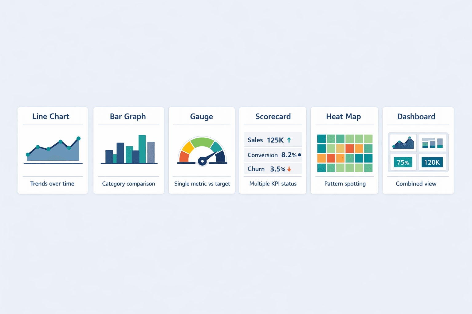
Data Visualization in KPI Reports
KPI reports use visual elements to make complex data immediately understandable. The right chart type helps both technical and non-technical audiences grasp performance in seconds instead of parsing tables of numbers.
Common visualization types in KPI reports:
- Line charts — Show trends over time (revenue growth, customer count changes)
- Bar graphs — Compare performance across categories (sales by region, product lines)
- Gauges — Display single metrics against targets (70% of quarterly goal achieved)
- Scorecards — Present multiple KPIs with status indicators (green/yellow/red)
- Heat maps — Highlight patterns across two dimensions (sales by product and quarter)
- Dashboards — Combine multiple visualization types in one interactive view
Pro tip: Consistent color coding reduces interpretation time by up to 40%. If green means “on track” and red means “attention needed” in one report, use the same scheme everywhere. Don’t make readers relearn your visual language every time.
Report KPI
Not every metric deserves a spot in your KPI report. Effective KPIs must support your bigger goals and be clearly defined, measurable, actionable, time-bound, and accessible to the people responsible for outcomes.
Selecting which KPIs to report means focusing on what truly matters. Tracking every possible metric buries important signals in clutter—most organizations should track just 3-5 core KPIs per major goal. Choose metrics that reflect business objectives, are critical to success, and allow corrective action through early problem detection.
Categories of KPIs in Reports
Different business functions track different types of performance metrics:
- Financial KPIs — Gross profit margin, net profit margin, working capital, operating cash flow, revenue growth rate
- Operational KPIs — Overall equipment effectiveness, first-pass yield, on-time delivery, production downtime
- Customer KPIs — Customer acquisition cost, customer lifetime value, churn rate, satisfaction score, retention rate
- Employee KPIs — Employee satisfaction index, turnover rate, productivity metrics, training completion
- Quality KPIs — Defect rates, error rates, compliance adherence, customer complaint resolution time
- Growth KPIs — Market share, new customer acquisition, expansion revenue, year-over-year growth
- Project KPIs — On-time delivery percentage, budget variance, scope completion, resource utilization
- Sales KPIs — Conversion rate, average deal size, sales cycle length, pipeline value, quota attainment
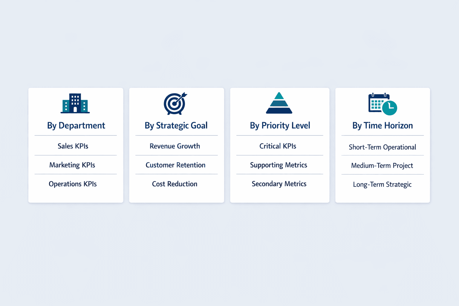
How to Organize KPIs Within Reports
Structure your KPI report so readers can quickly find what matters to them. The best organizational approach depends on your audience and business model.
Common organization methods:
- By department — Sales KPIs, marketing KPIs, operations KPIs (works well for cross-functional leadership)
- By strategic goal — Revenue growth metrics, customer retention metrics, cost reduction metrics (connects directly to business objectives)
- By priority level — Critical KPIs first, followed by supporting metrics (helps readers focus on what matters most)
- By time horizon — Short-term operational metrics, medium-term project metrics, long-term strategic metrics
Balanced Scorecard approaches organize metrics across Financial, Customer, Internal Processes, and Learning & Growth perspectives. A public university tracked 39 KPIs across four themes: student success, finances, faculty research, and diversity—showing how thematic grouping works in practice.
KPI Reporting Frequency
How often you report depends on what you’re measuring and who needs to act on it. Strategic KPIs might only need quarterly review, while operational metrics need daily monitoring.
| Frequency | Typical Use Case | Detail Level | Audience |
|---|---|---|---|
| Daily | Operations monitoring, real-time performance | High detail, operational focus | Team leads, operations managers |
| Weekly | Project tracking, short-term goals | Moderate detail, tactical | Department managers, project leads |
| Monthly | Departmental performance, tactical goals | Balanced detail and summary | Department heads, senior managers |
| Quarterly | Strategic objectives, business planning | Summary with trends | Executives, board members |
| Annual | Year-over-year comparison, long-term strategy | High-level strategic view | C-suite, stakeholders |
Business leadership typically tracks strategic dashboards on monthly, quarterly, and annual cycles. Project teams might review KPIs weekly. KPI dashboards with real-time data help monitor performance as it happens, but not every metric needs that level of immediacy.
Frequently Asked Questions
What is a KPI report?
A KPI report is a structured document that tracks key performance indicators—quantifiable metrics showing how a team or organization is progressing toward important business objectives over a specific time period.
What is KPI report?
A KPI report is a business tool for measuring performance against goals. It presents selected metrics, targets, and actual results in a clear format so stakeholders can quickly understand whether they’re on track.
What's a KPI report?
A KPI report is a document that shows how well a business is performing on the metrics that matter most. It combines data, visualizations, and analysis to help people make better decisions based on actual results.
KPI report means?
KPI report means a performance tracking document that measures key indicators against business goals. It translates raw data into actionable insights about progress, problems, and opportunities.